Purple in Ms. Fr. 640 and how “Painters make it beautiful”
Debaleena Bagchi
Fall 2025
HIST GU4962: Making and Knowing in Early Modern Europe
Introduction
The color purple is mentioned five times in Ms. Fr. 640, an intriguing manuscript containing a plethora of descriptive and instructional recipes written by an anonymous author-practitioner in sixteenth-century Toulouse, France. Of the five entries for “purple,” one relates to glasswork (fol. 37v), two offer suggestions on using purple in painting (fols. 58r and 62r), and the two remaining contain “recipes” (fols. 43r and 10r). My paper focuses on the recipe in folio 10r, which is the first occurrence of “purple” in the manuscript.1 This recipe reads:
Painters make it beautiful, making the first ground of common azure, or better yet azur d’esmail, & next they glaze it with lake, which will be more appropriate for this if you mix in alum, which gives a violet tinge depending on the quantity you mix in.2
Adopting historical reconstruction as my primary methodology, my aim in this paper is to better understand this recipe and its place within the manuscript. I will build on the writings of previous scholars and collaborators on the Making and Knowing Project, such as Jo Kirby, Marika Spring, and others, to corroborate certain traits of the author-practitioner that they have already convincingly suggested—his relative unfamiliarity with painting and his assumption that his readers possess working knowledge of the materials and mediums he discusses and will modify the recipes at their discretion. Ultimately, citing my experience of reconstructing the recipe, I will demonstrate that the entry for purple confirms the author-practitioner’s tendency to offer efficient, artisanal repurposing and waste-management solutions.
To address these different yet complementary goals, I have divided the paper into two sections. The first will offer a thorough reading of the recipe and cite primary and secondary sources to justify the choices I have made for my reconstruction, and the second will present my reconstruction report. For the former, and even more extensively for the latter, I have relied heavily on my existing knowledge of working with paint developed during my training as an oil painter (just as the author-practitioner seems to demand from his readers).
Historical Context and Literature Review
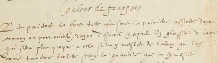
Figure 1: Detail of fol. 10r, from Making and Knowing Project, Pamela H. Smith, Naomi Rosenkranz, Tianna Helena Uchacz, Tillmann Taape, Clément Godbarge, Sophie Pitman, Jenny Boulboullé, Joel Klein, Donna Bilak, Marc Smith, and Terry Catapano, eds., Secrets of Craft and Nature in Renaissance France. A Digital Critical Edition and English Translation of BnF Ms. Fr. 640 (New York: Making and Knowing Project, 2020), https://edition640.makingandknowing.org.
The recipe offered by the author-practitioner can be divided into two easy steps:
-
Make “the first ground of common azure, or better yet azur d’esmail…”
-
“…glaze it with lake, which will be more appropriate for this if you mix in alum, which gives a violet tinge depending on the quantity you mix in.”
However, as a modern reader of twenty-first-century recipes that minutely spell out each step and leave almost no room for subjective interpretations, my initial reading of the author-practitioner’s recipe raised more questions for me than it answered. Is this recipe for oil paint or for another medium? What is azure d’esmail? With what “lake,” which produces a violet tinge when mixed with alum, must the common azure or azur d’esmail be glazed? What are the quantities of each? What is a glaze, and how transparent must it be? And, on what surface must the glaze be applied and with what utensils?
To find answers to these questions, I first looked within the manuscript, and then broadened my search to include other primary and secondary sources. This process also helped me confirm the list of supplies that I had tentatively made a note of when deciding to probe further into this recipe.
The Color Purple
When I initially read this recipe on fol. 10r, I assumed it meant that azure pigment and a second lake pigment had to be mixed together to create purple. However, upon rereading it more attentively, I realized that what the author-practitioner recommends is making paint with azurite and another lake separately, and then layering them in thin glazes on top of one another on a painting surface so that the colors optically mix to create purple. I found that this reading corroborated what Jo Kirby and Marika Spring have written in their essay “Ms. Fr. 640 in the World of Pigments in Sixteenth-Century Europe”:
Purples and violets were usually obtained by mixing blue with a red pigment, often red lake. In the sixteenth century, however, painters appeared to have developed an alternative method in addition: applying a translucent layer of paint containing a red lake pigment (such a layer is known as a glaze) over a layer containing a blue pigment, as described by the author-practitioner: “Painters make it beautifully by making the first layer of common azur, or better yet azur d’esmail, & next they glaze it with lake” (fol 10r).3
Nevertheless, I wanted to find more exacting details to justify the choices I would make for my historical reconstruction exercise. And to do that, I turned to The Making and Knowing Project’s Research and Teaching Companion, to the manuscript, and to external sources.
As the recipe for purple on fol.10r called for two main “ingredients”—azure (or azure d’esmail) and lake—I began planning for my historical reconstruction by first attempting to decipher what was meant by azure or azure d’esmail.
In his essay “What is Azur in Ms. Fr. 640?” Carl Garris textually analyzes, tabulates, and historically reconstructs the many recipes involving azur in Ms. Fr. 640 to identify cendres dazur in the manuscript with verditer and azure d’esmail with smalt.4 Furthermore, in her detailed essay “What is Esmail in Ms. Fr. 640?” Amy Chang writes that esmail translates to “enamel,” but the author-practitioner’s understanding and application of the word esmail would have been different from our modern understanding of “enamel.”5 Chang concludes by stating that the word esmail was “used to describe processes that may or may not include heat,”6 and that the author-practitioner’s use of esmail across mediums suggests “that enamel is understood to describe the glass-like visual effect rather than the materials or process involved.”7 Extrapolating from this conclusion, I was able to read the recipe I was following from fol. 10r to mean that the paints used should be thin like enamel and have a glass-like effect, or, what is otherwise known in oil painting as a glaze. Having established this, I turned my attention to the lake with which I was to glaze the azure paint.
Fol. 57v of Ms. Fr. 640 bears a dedicated section titled Painctre (“Painter”) which continues over to the next folio, 58r. Apart from including one of the few entries in the manuscript to mention “purple,” the pithy notes on these folios only speak of oil paint and oil painting, and indicate the use of walnut oil as a binder. Even in the entry on paintbrushes on fol. 58v, the author-practitioner alludes to oil paint. These other entries in the manuscript answered some of the important questions about material and medium I raised above and helped me conclude that my historical reconstruction would be in oil paint and would use walnut oil as the binder.
Furthermore, on fol. 58r, the author-practitioner writes,
…To make a beautiful flesh color, the reddest & liveliest lake is the best, for the kind that contains purple & violet, by admixture of too much alum, makes flesh color like that of one who is very cold. That is why ladies, wanting to color their cheeks, grind Florence lake very finely, then fill a little cotton with it, which they next wrap in a little fabric of Cambray which is clear…8
This “liveliest” Florence lake, or Florentine lake, “is a deep, transparent, ruby-red lake pigment with bluish undertone, made from kermes, a natural dyestuff of insect origin,” writes Sarah Lowengard in The Creation of Color in Eighteenth Century Europe.9 So, in the abovementioned entry from fol. 58r, the author-practitioner seems to suggest that adding too much alum to Florence lake, which is red, will give it a purplish or violent tint. By contrast, in the recipe for purple on fol. 10r, he recommends adding alum to the lake that will be applied as a glaze over the azure glaze. Therefore, we can say quite conclusively that the second color, the lake, mentioned in the recipe for purple on fol. 10r is a red lake.
To make this red glaze, I might have used store-bought kermes pigment. However, since making lake pigment from cochineal was a part of the “Making and Knowing in Early Modern Europe” course module conducted in Fall 2025, it felt opportune to use the lake that was made in class instead. In fact, since Sarah Lowengard writes that “carmine lake began to replace Florentine lake in the 16th century, with the availability of cochineal,”10 repurposing the lake pigment made in class was not only practical and cost-effective, but also historically justified.
Of course, even before beginning my research into the project, I was aware that red and blue make purple, so the glaze that would be applied on top of the azure glaze for my historical reconstruction would have to be red. However, cross-referencing the two separate entries on fol. 10r and fol. 58r, as I have done above, allows me to demonstrate the intra-textual connections that exist within the manuscript, by virtue of which questions raised by one “recipe” can be answered by another. The recurrence or repetition of materials throughout the manuscript might also indicate that the author-practitioner was drawing his information from a specific and limited pool of artisanal knowledge. This is particularly evident in the case of purple, because other recipes for making the color certainly existed at this time; however, the author practitioner only notes one.
These other recipes can be found in manuscripts contemporaneous to Ms. Fr. 640. For example, The Secrets of the Reverende Maister Alexis of Piemount contains a recipe that calls for mixing tin with quick silver and stirring it over a fire to create “a very fayre purple coloure lyke the colour of golde…”11 (fig 2). Pamela Smith in the “Introduction to Ms. Fr. 640” has written that the entries in the manuscript “for dyeing fabrics, cosmetic techniques, and making perfumes, as well as recipes for concocting earths and binders for making sand molds for casting, are analogous to those found in the Secrets of Alessio Piemontese…”12 Given these marked similarities between the content and techniques offered in the two manuscripts, it is curious that the recipes for purple are so vastly different. This suggests three things: that the author-practitioner consulted a range of sources for his manuscript, that there certainly existed one other contemporary recipe for purple (paint) that the author-practitioner had access to, and, perhaps more importantly, the sheer difference in the “ingredients” makes Piemount’s a highly specialized recipe, whereas the author-practitioner’s is much more approachable. It must also be noted that in Ms. Fr. 640, the recipe for purple on fol. 10r appears right after a recipe for counterfeiting jasper and another for making roses out of horn shavings. Taken together, this might imply that the author-practitioner’s recipe for purple is consistent with his tendency to offer cost-effective, practical solutions and alternatives.
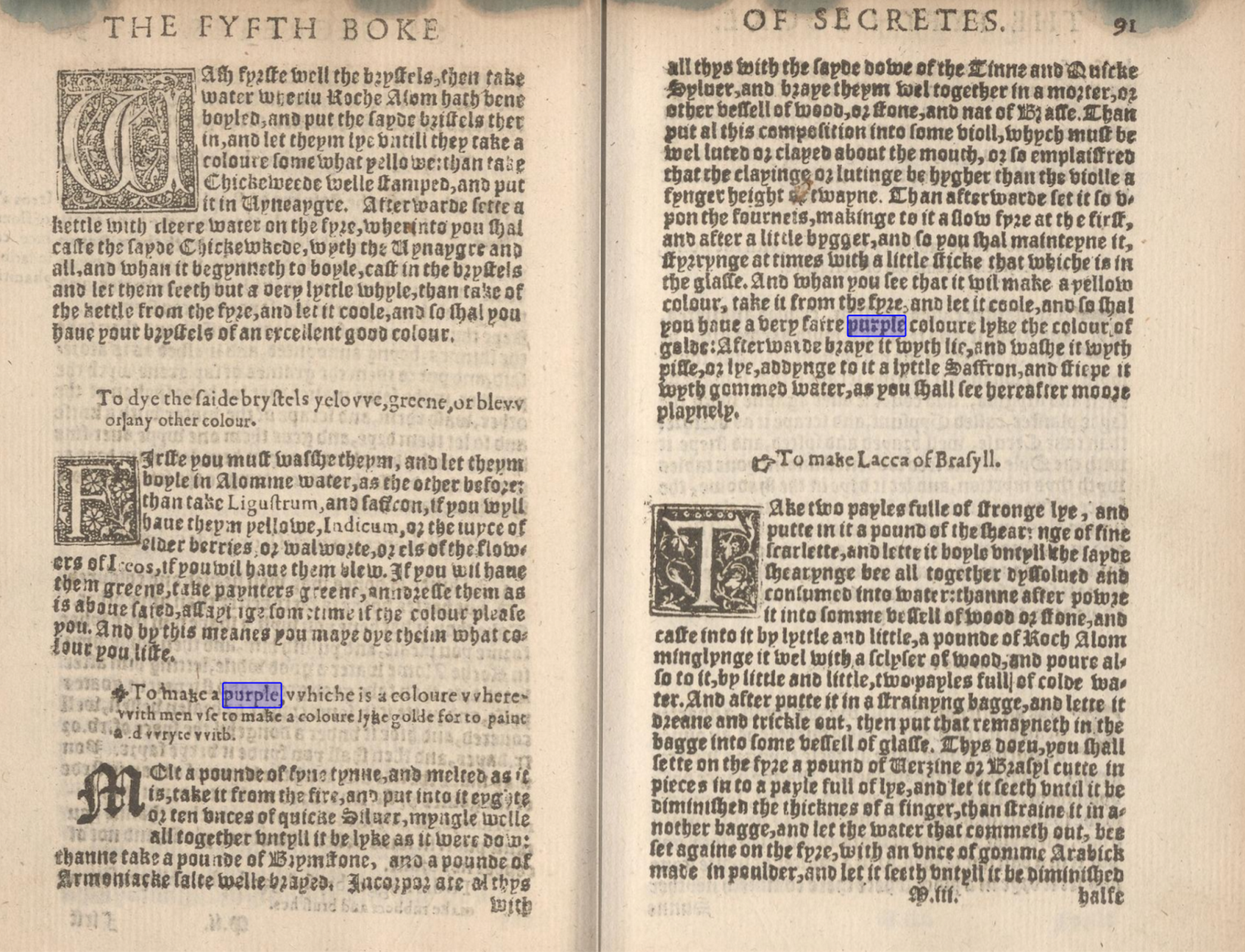
Figure 2: Page 91 of The Secrets of the reverende Maister Alexis of Piemount showing a recipe “To make a purple, which is a coloure wherewith men vse to make a coloure lyke golde, for to paynte and wryte with.” Source: The Internet Archive, https://archive.org/details/secretesofrevere00rusc/page/n201/mode/2up.
The Illuminierbuch by Valentin Boltz von Raffach, published in 1549, also contains recipes for several kinds of purple,13 some of which are similar to what the author-practitioner offers. For instance, one recipe calls for using a dark rose color and shading it with sap green or madder or indigo (fig 3). Another recommends using Paris red and rich azure, and adding highlights with ground silver or lead white (fig 4).
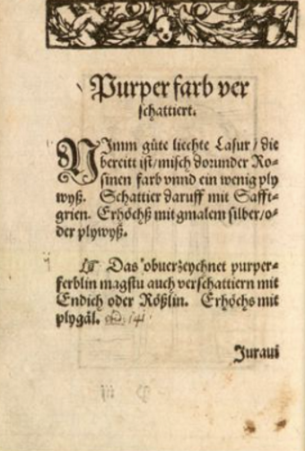
Figure 3. Page 218 of Illuminierbuch by Valentin Boltz von Raffach, published in 1549.14
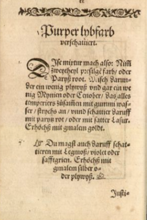
Figure 4. Page 220 of Illuminierbuch by Valentin Boltz von Raffach, published in 1549.15
Furthermore, the Bolognese Manuscript recommends adding sappanwood or brazilwood to ultramarine to create purple.16 Apart from these, the largest number of recipes for purple I was able to find were in Cennino Cennini’s Il Libro delle’Arte. To study this manuscript, Lara Broeke’s expertly detailed and minutely annotated translation proved most useful.
Broeke notes close to sixteen mentions of “purple” in Cennini’s Il Libro dell’Arte Interestingly, under the index for “violet” she writes “see purple,” suggesting the two colors have been used interchangeably.17 The recipes for purple here are mainly for frescoes, and on occasion, different medium-specific recipes are recommended. Important for this essay are recipes in chapters 73 and 74.
In Chapter 73, under the title “The way to know how to make a violet colour,” Cennini writes:
If you want to make a lovely violet colour, take fine lacca, ultramarine blue (the same amount of one as the other) with a binder. Then choose three pots as above and leave some of the violet colour in its little pot for touching in the darks. Then, from what you take out of it, make three shades of colour for laying in the clothing, graded each lighter than the other…18
Broeke notes that this mixture has been identified on fresco paintings from the period, most notably Fra Angelico’s The Mocking of Christ (fig 5).19
In Chapter 74, Cennini recommends: “If you want to make a violet to use in fresco, take indigo and hematite and mix them as for the one above without a binder. And make four grades from it in total. Then work up your clothing.”20
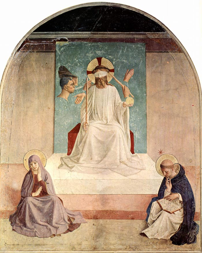
Figure 5. Fra Angelico, The Mocking of Christ, 1439-1443, fresco, Cell 7, Convent of San Marco, Florence (1439-43). Source: Wikimedia Commons.
While both these recipes are for fresco painting, and therefore not directly relevant to the reconstruction exercise in oil painting carried out in this paper, they provided me with some key insights. First, as Broeke points out, “In chapter 73 this colour [pink or violet] is made by mixing equal quantities of lake and ultramarine, while in chapter 74 the same colour is made for fresco by mixing equal quantities of indigo and hematite.”21 The variations observable in just two recipes in this Renaissance manuscript confirms the existence of multiple contemporary recipes for purple, thereby signalling the author-practitioner’s limited knowledge, as he only mentions one such recipe in Ms. Fr. 640. Second, since these two recipes from Il Libro dell’Arte provide instructions not only on the material but also on the technique, I used them to determine that to create the glazes for my recipe reconstruction, I would need to make three shades of the same color, grading “each lighter than the other.” As I was to work with oil glazes instead of lead white, which is commonly used in fresco painting, I chose instead to only use azurite and cochineal lake with a binder to preserve the transparency of the glazes and to keep them completely unadulterated. Interestingly, this technique of separating grades or values of color suggested by Cennini might also be observed in practice in an illustration from the Illuminier Buoch (fig 6).
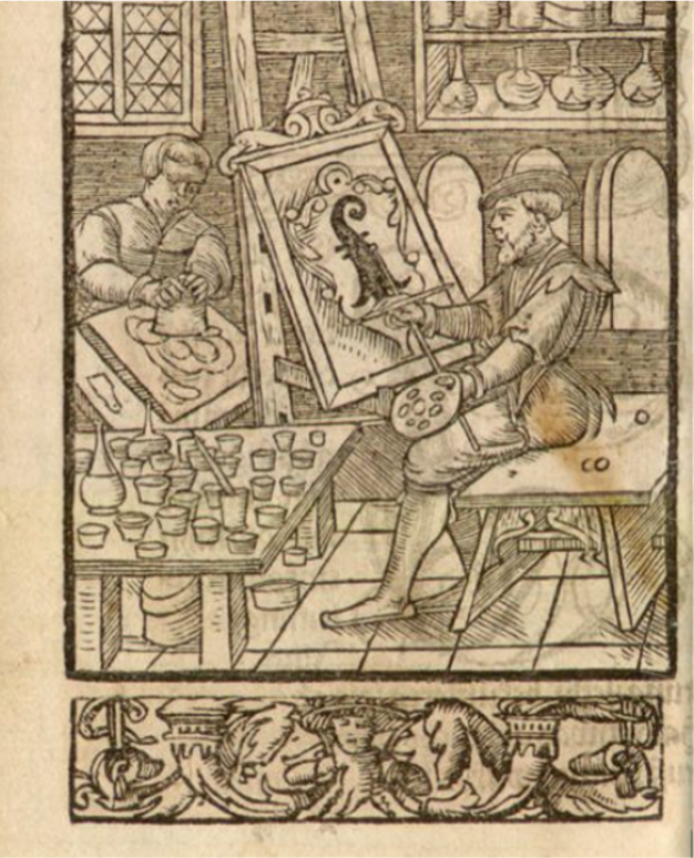
Figure 6. Page 22 of Valentin Boltz’s Illuminier Buoch shows a table with many small pots that can be presumed to contain different values of the same color used for painting. It is difficult to confirm whether the painting on the easel is being done on a stretched canvas or a wood panel and whether the paint used here is tempera or oil. Regardless, what is noteworthy is the presence of small pots on the table. This gives us an insight into the technique that might have been used by Renaissance and early modern painters to keep their precious colors separated until they needed to be used and/or mixed.
Here, it is worth pointing out a key difference between the recipes suggested by Cennini and others and that by the author-practitioner. For others, particularly for Cennini, the recipe seems to imply that two colors, red and blue (derived from a range of natural substances), are to be mixed together, and different values or grades created from this mixture. In contrast, the author-practitioner suggests that azure glaze and the red lake glaze must be kept separate. This is perhaps (as already suggested once above) aligned to his tendency to offer cost-effective waste management solutions. Since blue and red paint are more commonly used than purple, keeping them separate, rather than blended into a third color, offers more usability.
One commonality between all the recipes, including the author-practitioners’, is that they use a blend of at least two materials to create purple and do not mention a singular purple pigment. This is perhaps because “none were available at this date…” except purple fluorite, which was the only exception to this rule, as Jo Kirby and Marika Spring specify in “Ms. Fr. 640 in the World of Pigments in Sixteenth-Century Europe.”22 However, it appears that folium, also known as “turnsole” (Crozophora tinctoria),23 which can be obtained from vegetal sources, was also a common natural ingredient for making purple. In fact, in an essay titled “A diagnostic study on folium and orchil dyes with non-invasive and micro-destructive methods,” authors Maurizio Aceto, Aldo Arrais, et al. confirm that folium was used in painting and textiles as a substitute for Tyrian purple. They conclude by saying,
From the artistic point of view, the use of folium and orchil in painting is certainly suitable for obtaining a range of hues from red to blue through purple, as described in several medieval artistic treatises. Therefore, despite the very low number of identification on artworks, the number of instances in which these dyes could have been used is possibly much larger than the number of actual identifications.24
Folium grew in southern France in the sixteenth century, so it is likely that the practice of using folium for purple existed in the author-practitioner’s vicinity. Therefore, his omission of this recipe, and the other contemporary recipes for purple noted earlier, points to his relative unfamiliarity with the world of paints and pigments. This validates what Kirby and Spring have already concluded in their essay: “…this manuscript is fairly unusual in that much of the information on painting it contains gives the impression of having been acquired by observation of someone at work, or during conversation with someone trained as a painter.”25
Another of Kirby and Springs’ conclusions has been vital to my reconstruction. They confirm walnut oil—which I decided to use based on my reading of Ms. Fr. 640—as being a more common binder in southern Europe, as opposed to linseed oil, which was more common in northern Europe. From this we might deduce that the Toulouse artists from whom the author-practitioner sourced his information would have preferred walnut oil for their use. Walnut oil is clearer than linseed oil, which “yellows the most, at least initially, with age.”26 Walnut oil is also a preferable choice to linseed oil because adding the latter to a blue pigment might result in a greenish tinge. Moreover, using linseed oil as a binder for cochineal lake pigment might yield a warmer red, which is not as ideal as a cool-toned red, since purple tends to be cool-toned.
While this combination of pigment and binder (walnut oil in my case) would have been adequate for painting, my training in the medium prodded me to find a thinning agent that could be added to this mixture. Oil paint made solely from pigment and oil can be thick and become unwieldy with time. It can congeal easily and result in a streaky application. Therefore, the addition of a thinning agent not only reduces the viscosity of the paint, making for easier application, but it also reduces drying time—a feature that would be helpful for my reconstruction exercise as I was to paint in thin layers. However, the author-practitioner does not indicate the use of any thinners in the recipe for purple on fol. 10r. By contrast, on fol. 61v, he does recommend using “a little turpentine, but hardly any” when painting with azur d’esmail in oil.27 Since I was certainly painting with azurite in my reconstruction exercise, I used this entry on fol. 61v to conclude that I could sparingly use turpentine. Taking some creative liberty, I also decided to use turpentine (again, sparingly) with cochineal paint in an effort to ensure the viscosity and drying time of the two oil paints remained comparable.
To summarize, I was able to infer and reasonably demonstrate the author-practitioner’s relatively limited knowledge of painting, painting techniques, and materials, especially compared to his extensive knowledge of metalcasting, by consulting other entries in Ms. Fr. 640 alongside those in other early modern and Renaissance manuscripts and additional secondary sources. This exercise served two other functions. First, it allowed me to posit that the recipe for purple on fol. 10r of Ms. Fr. 640 is aligned to the author-practitioner’s proclivity for efficiency and economy of materials. Second, it helped me develop a full list of “ingredients” for my historical reconstruction and a workable, historically plausible technique.
Finally, having completed this research, there remained three more things I still had to determine—the painting utensils, the painting surface, and a master image.
Tools, Materials, and a Master Image
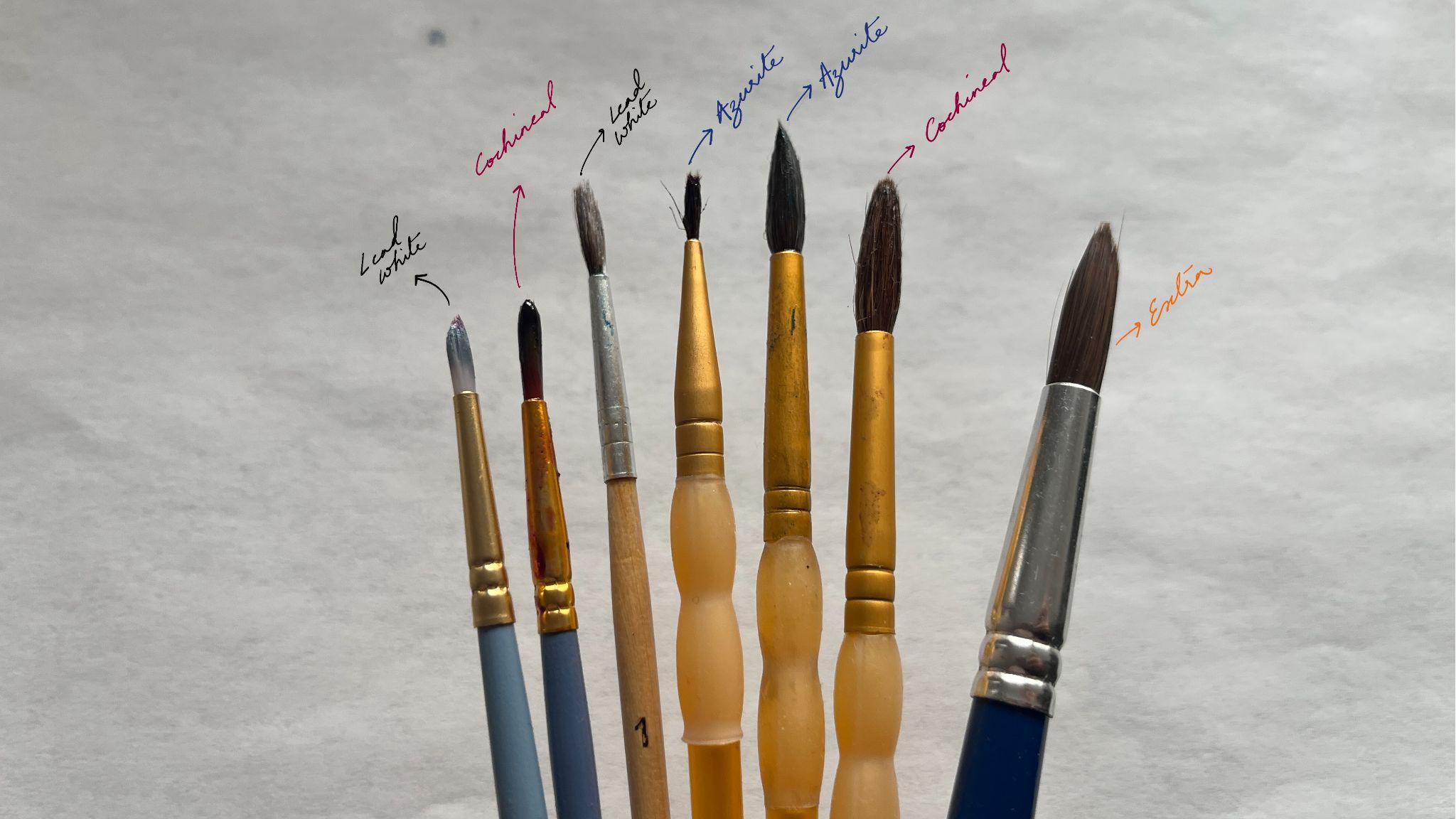
Paintbrushes made from animal hair were the most common painting utensils in the mid-sixteenth century. The recipe for making such paintbrushes mentioned by the author-practitioner of Ms. Fr. 640, and their use in painting, has been elaborated upon by Danielle Carr in the essay “Paintbrushes in Ms. Fr. 640.” For the reconstruction detailed in this essay, the author uses squirrel hair and a quill from a goose feather.28 Given this insight, I initially attempted to source a squirrel hair quill paintbrush, but after a quick Etsy search, the expense felt unjustified. I then found squirrel hair and hog hair paintbrushes with a wooden handle at my local stationery shop, but these too seemed prohibitively expensive. So, taking a page directly out of the author-practitioner’s playbook, I decided to use some of the many paintbrushes that were already available in the Making and Knowing Lab. From my training as an oil painter, I was familiar with the texture of animal hair brushes. So, I went through the Lab’s brushes, feeling the bristles to pick out the ones that felt like animal hair or like a close synthetic replica for my use.
I ended up with the following set of brushes. I assigned each one to the three colors I would use—cochineal, azurite, and lead white—to prevent any cross-contamination between them.
Then, to determine my painting surface, I returned to Ms. Fr. 640. The manuscript contains about twenty-five mentions of “canvas” linked mostly to oil paint. In the table below, I have provided some examples that are extremely relevant for my historical reconstruction and added my inferences next to the entries.
Table 1. Mentions of canvas in Ms. Fr. 640 and the inferences I draw from them.
| Entry from Ms. Fr. 640 | Inference |
|---|---|
Folio 42v |
This entry suggested to me that the author-practitioner recommends not just any canvas, but a canvas treated and prepared for oil painting. Due to time constraints, I was not able to recreate this recipe alongside the one for purple, so I took the liberty of buying prepared canvas for my recipe reconstruction. |
Folio 93v |
This entry, I posit, offers the perfect justification for using canvas for my reconstruction because the author-practitioner’s recipe for purple calls for using azur d’esmail as the first substance that is applied to the canvas. |
Folio 165r |
This entry, too, helped me confirm my decision to use a prepared, store-bought canvas stretched on a wooden frame. |
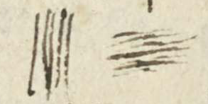 It is better used on
canvas, where it is imbibed immediately, than on wood.
It is better used on
canvas, where it is imbibed immediately, than on wood.Using these entries as my justification for using a canvas for my painting surface,29 I purchased two canvases from Blick, New York: one for creating my paint swatches and another for the painting reconstruction.
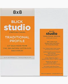 |
Canvas for color swatches |
|---|---|
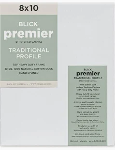 |
Canvas for painting |
Finally, it was time to choose an appropriate master image for my reconstruction. For this portion of the project, rather than adhere strictly to the subject matter mentioned in Ms. Fr. 640 that calls for the use of purple—shadows on faces and crowds in the distance—I chose to paint a textile instead. This decision was a practical one because painting faces, or people in the background, would require me to paint several elements to make a cohesive tableau. Instead, painting a textile would allow me to paint just that. My decision to go this route was not entirely detached from the manuscript, however, because I was inspired by instructions on painting cloth offered by the author-practitioner on fol. 59v:
Folds in clothing In this, one needs to take care that none are made false, but that only that which the natural can do is imitated. A thick cloth hardly makes any folds, taffetas & silk cloth make more, & crêpe more still.
MakeHeed which ones should go lengthwise & others across.
As a painter myself, I found this to be an incredibly observant entry, in spite of the author-practitioner’s perceived unfamiliarity with painting as a medium. So, after researching mid-sixteenth-century southern European oil paintings that feature purple textiles, I settled on recreating a portion of the purple dress from Lorenzo Lotto’s Christ Taking Leave of his Mother, dated 1521 (fig 7).
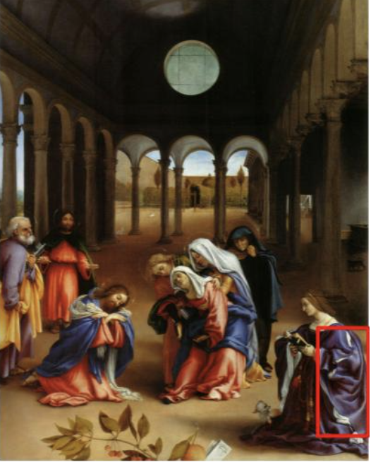
Figure 7. Lorenzo Lotto, Christ Taking Leave of his Mother, 1521. The red rectangle indicates the area of the painting that I chose to recreate for my reconstruction.
Historical Reconstruction Report
In an attempt to find proof-of-concept for this recipe and test its efficacy, I decided to recreate it following the author-practitioner’s (brief) instructions. The paucity of details meant that I had to rely heavily on my own judgement.
Before beginning my reconstruction, I made a list of materials and broke the process down into the steps described in the following table.
Table 2. The process of making cochineal oil paint from powdered cochineal lake made in class
| Image | Notes and Observations |
|---|---|
| N/A | Step 1: Procure cochineal pigment |
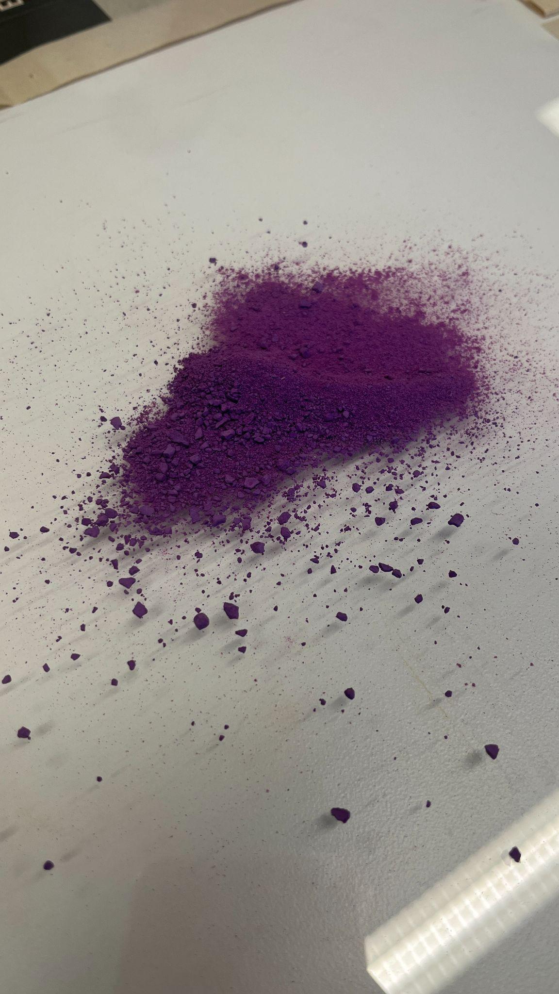 |
Step 2: Place pigment on a glass plate |
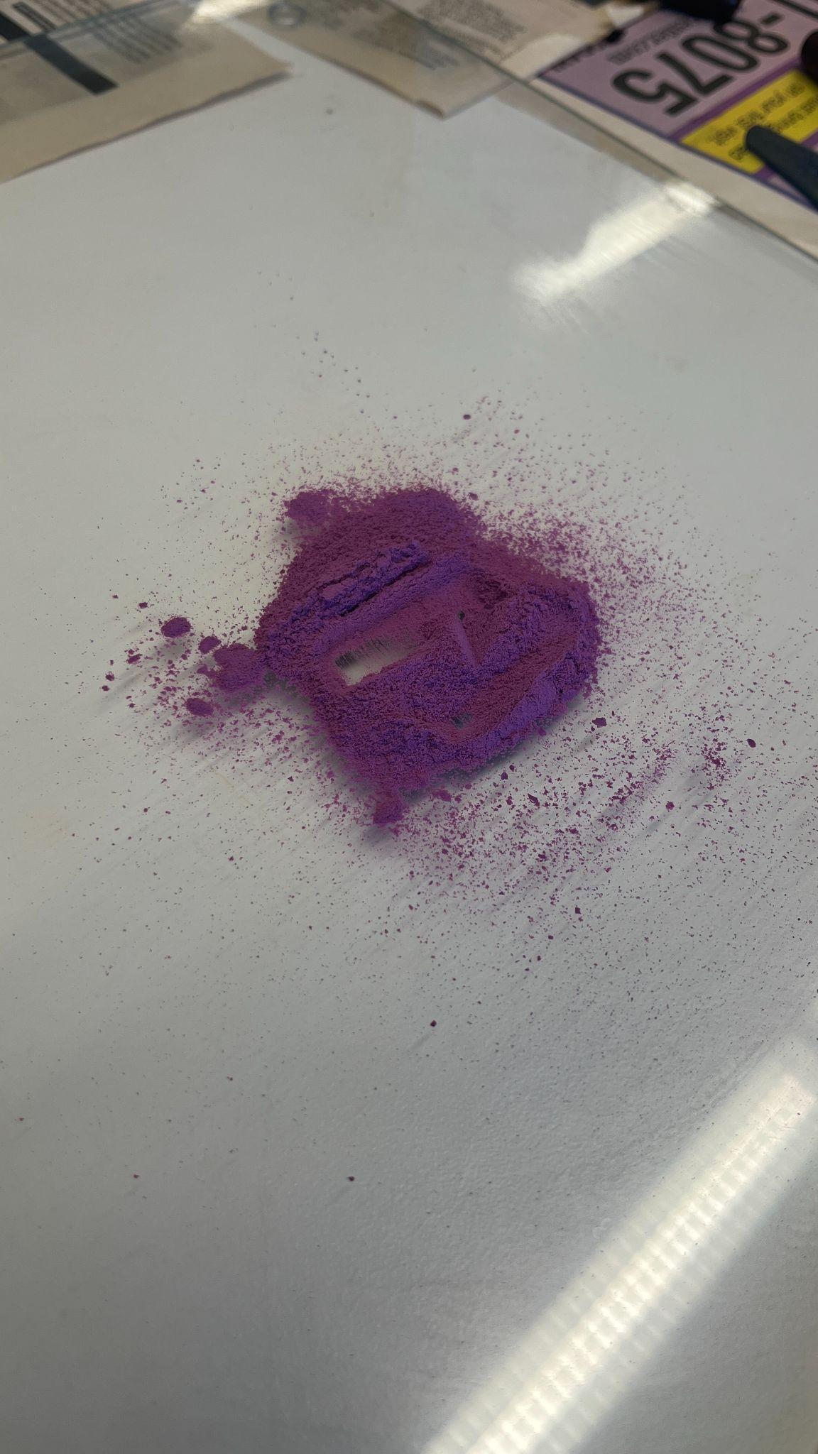 |
Step 3: Procure cochineal (extra) |
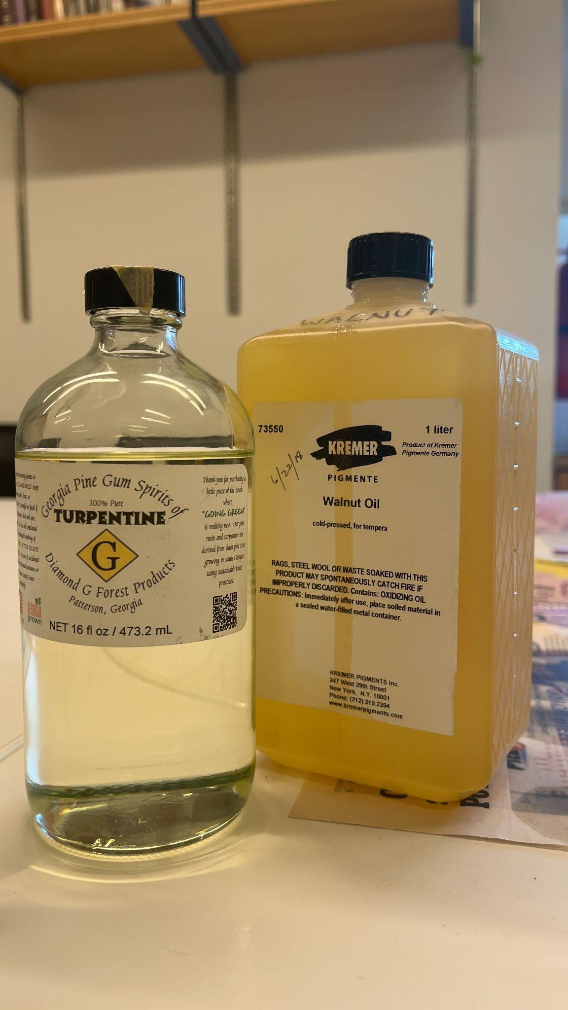 |
Step 4: Procure binding and mixing agents |
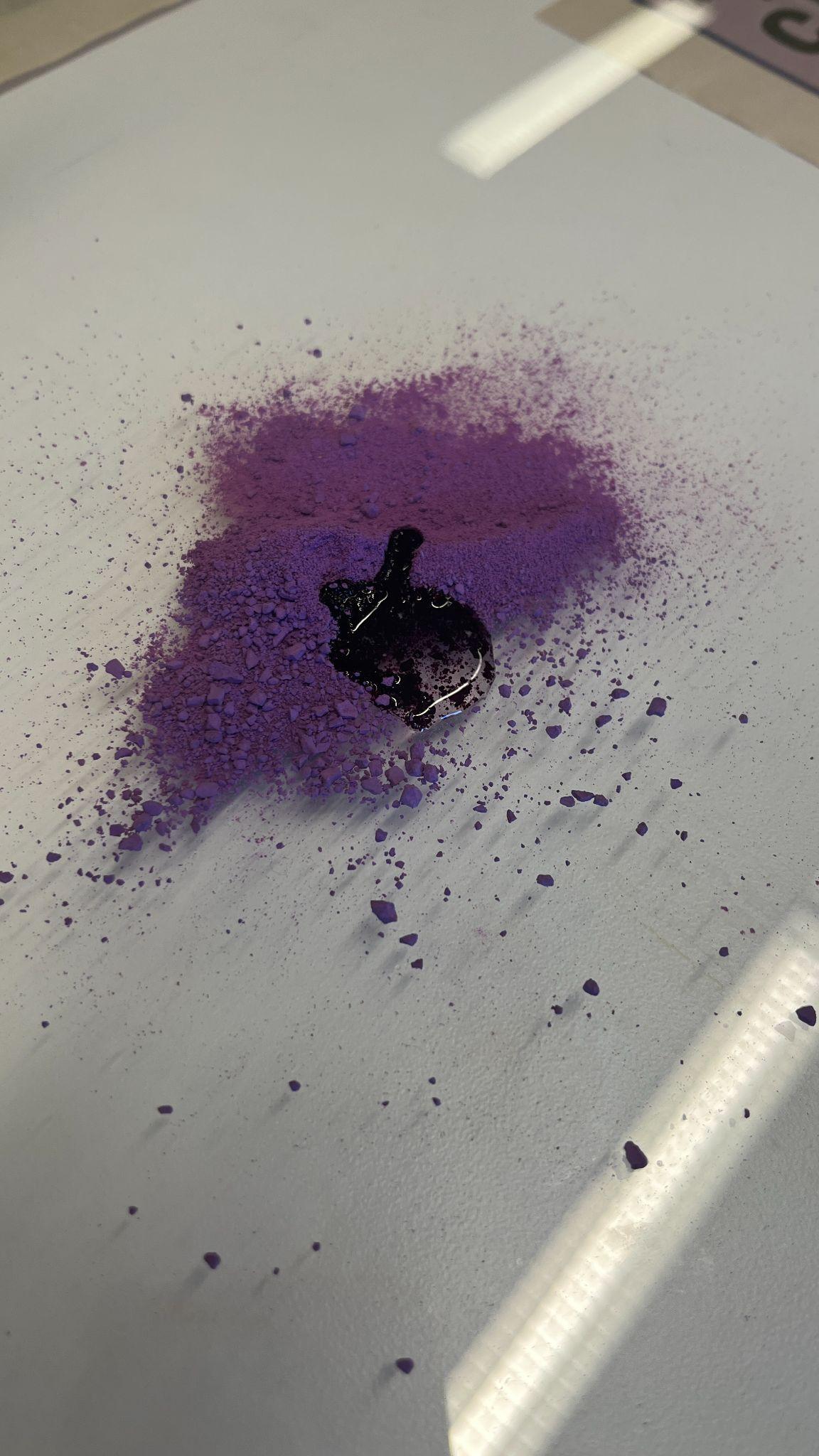 |
Step 5: Mix pigment and binder |
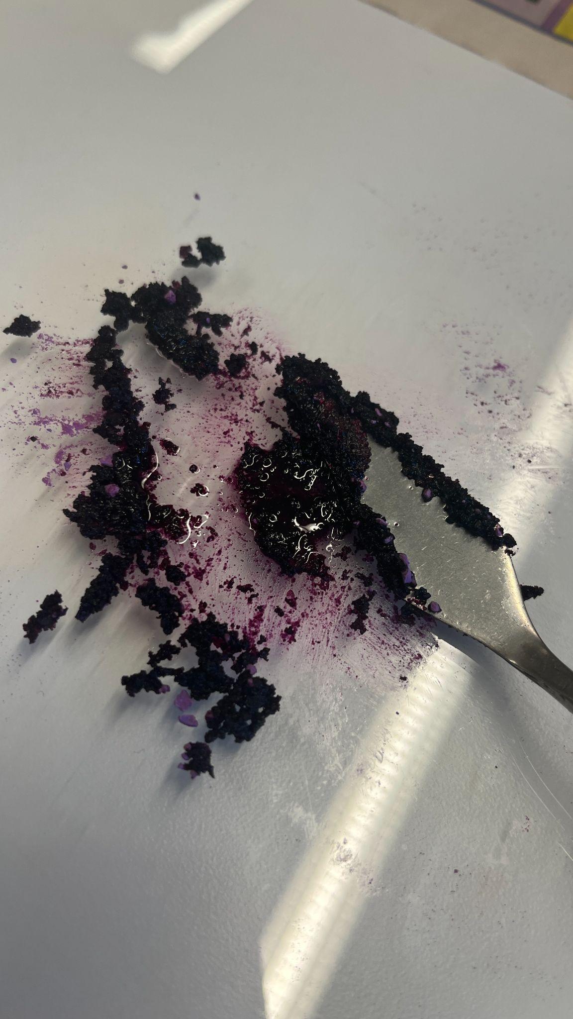 |
Step 6: Mix pigment and binder with a palette knife until roughly
incorporated |
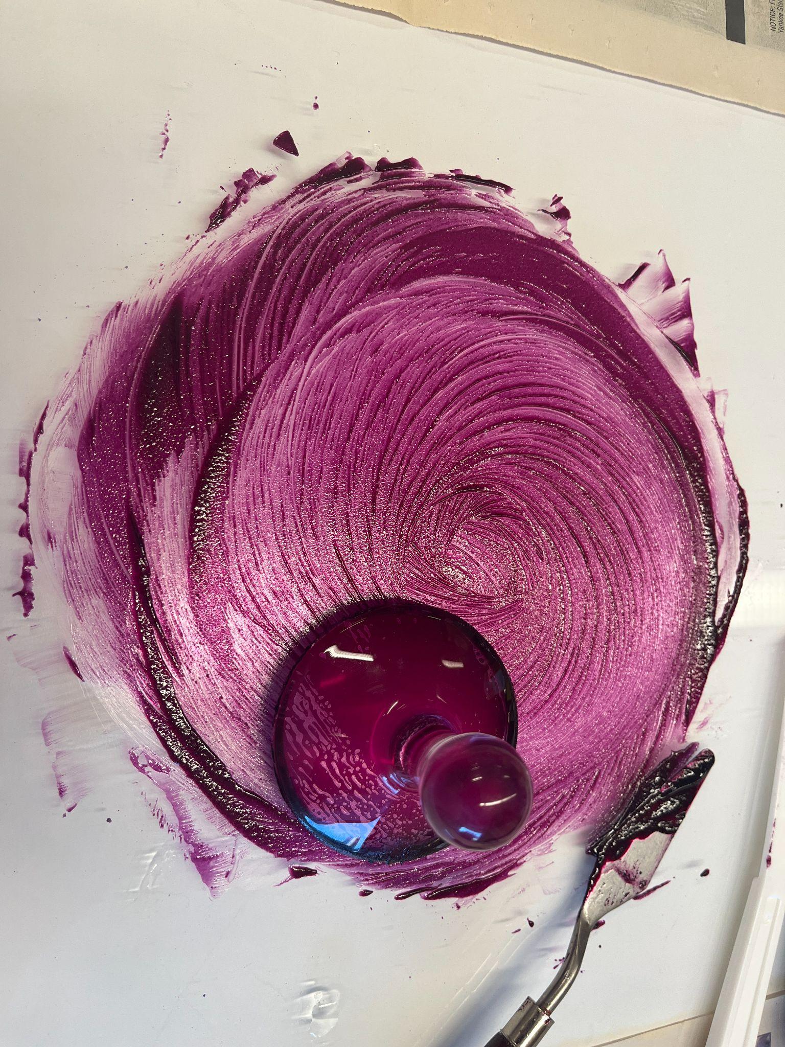 |
Step 7: Mull the mixture together |
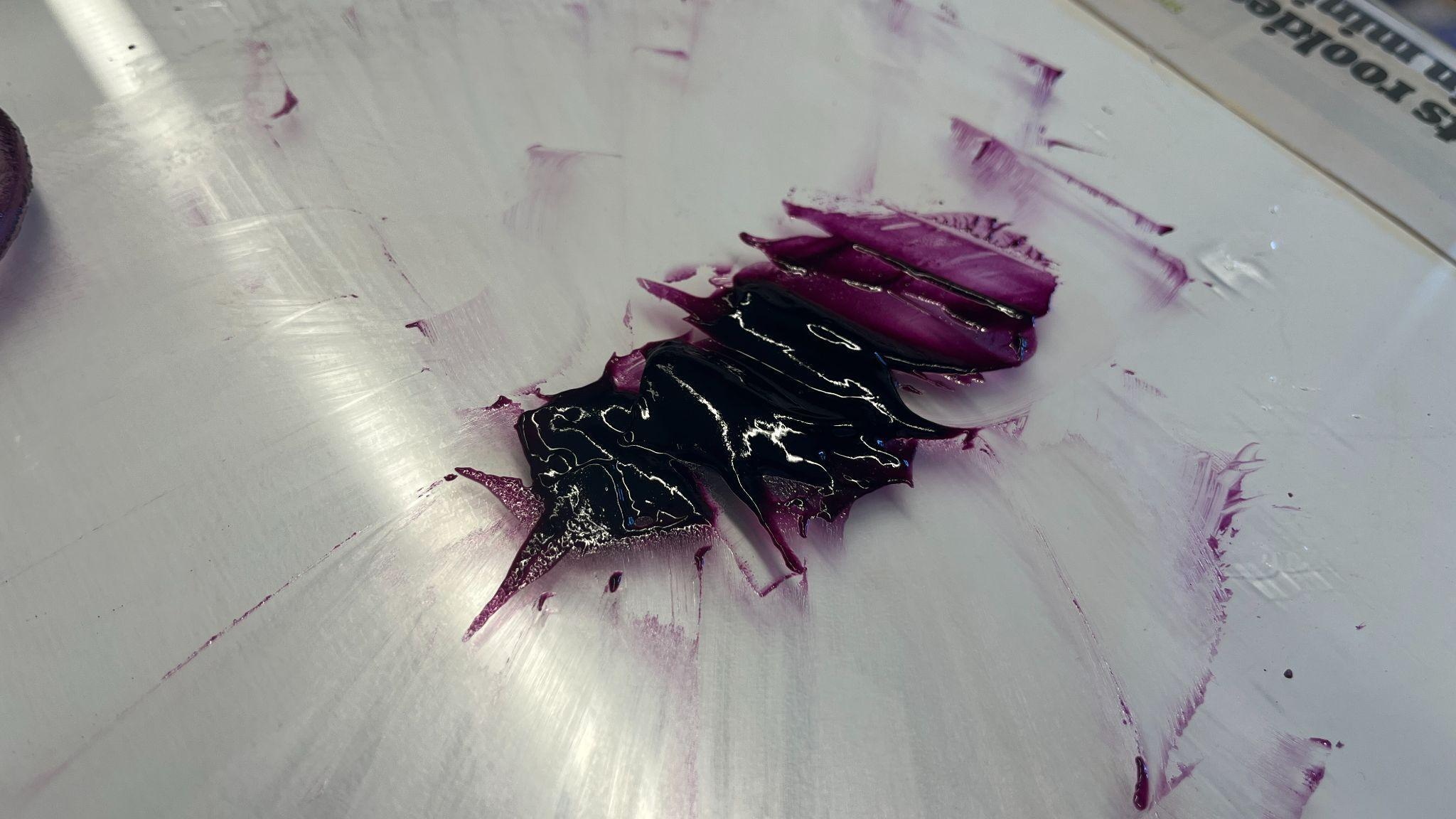 |
Step 8: Stop mulling |
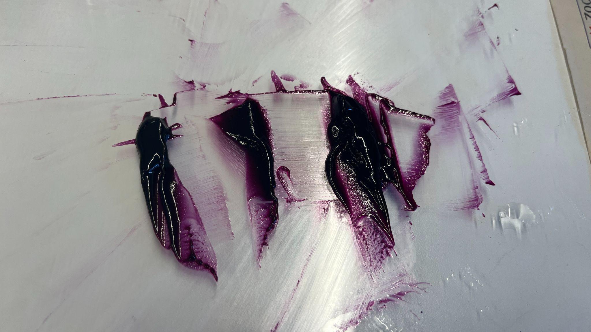 |
Step 9: Separate paint into three sections |
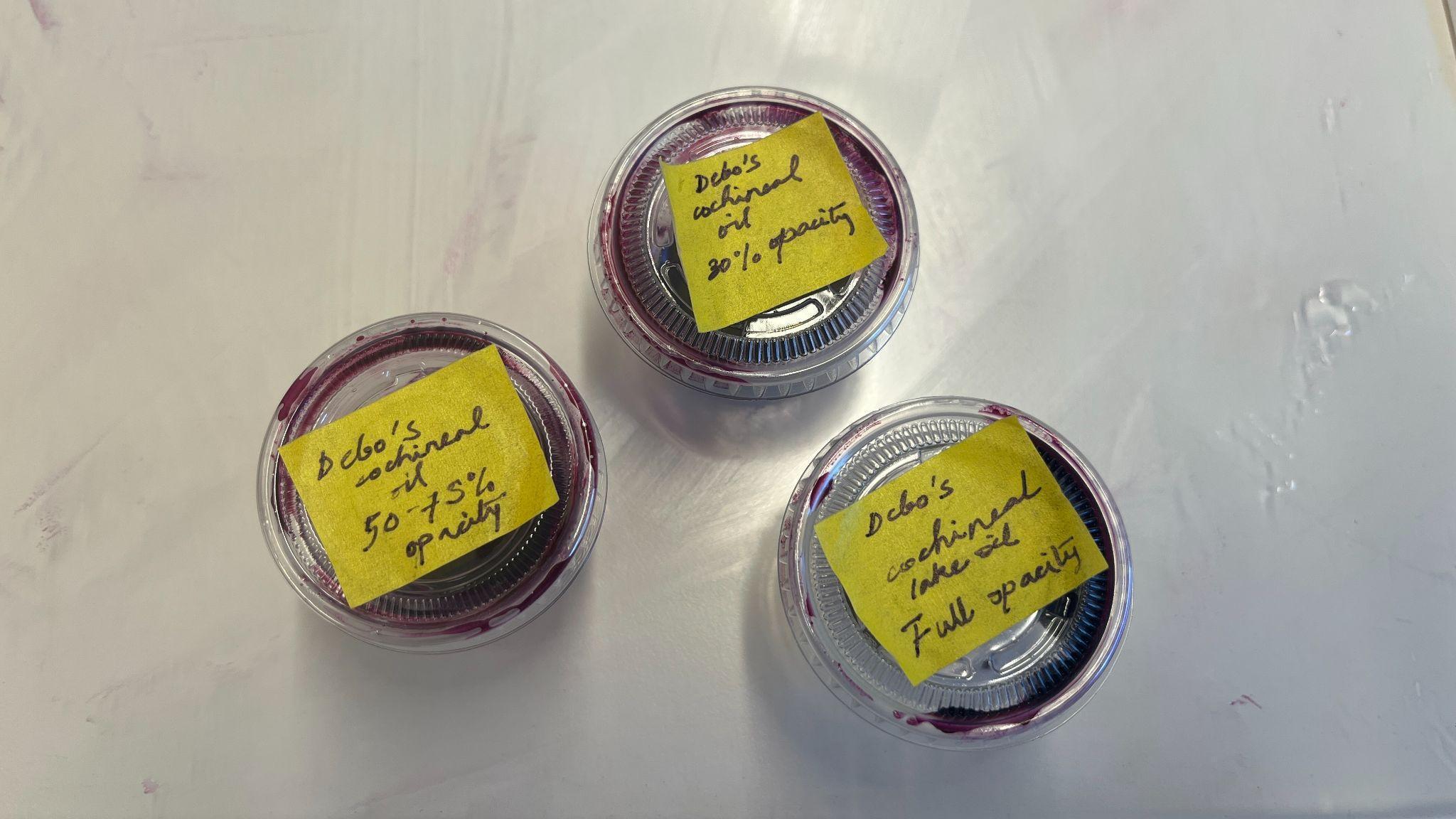 |
Step 10: Separate paint into containers |
Such a method of distilling turpentine from pine gum is consistent with what was practiced historically in Europe, especially in Northern Europe. More details about this can be found in James C. Groves, “Rubens’ Gum Spirits of Turpentine,” accessed December 13, 2025, http://www.jamescgroves.com/PINE.HTM.↩︎
Marjolijn Bol, The Varnish & the Glaze: Painting Splendor with Oil, 1100-1500 (Chicago: University of Chicago Press, 2023), 155. She defines oils as drying “when their components can form cross-linkages, initially by oxidation, the reaction with oxygen in the air. As a result of this polymerization process, which takes a very long time, the oil forms a solid film.”↩︎
Once I created my first batch of pigments, I wiped down my station and all my equipment with turpentine to create my second batch. This is a practice I brought over from my training as a painter. The best way I had learnt to clean my paintbrushes, palette knives, and workstation was to soak a cotton rag with turpentine and give everything a thorough wipe because the acidic pine spirit is highly effective in neutralizing the oil in oil paint.
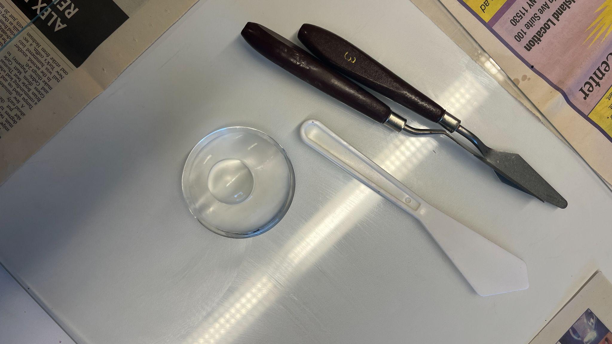
This process left my station looking practically untouched, and I was ready to begin working on my second batch of pigment, cochineal(H).
Table 3. The process of making cochineal(H) oil paint from powdered cochineal lake.
| Image | Notes and Observations |
|---|---|
| N/A | Step 1: Procure cochineal pigment |
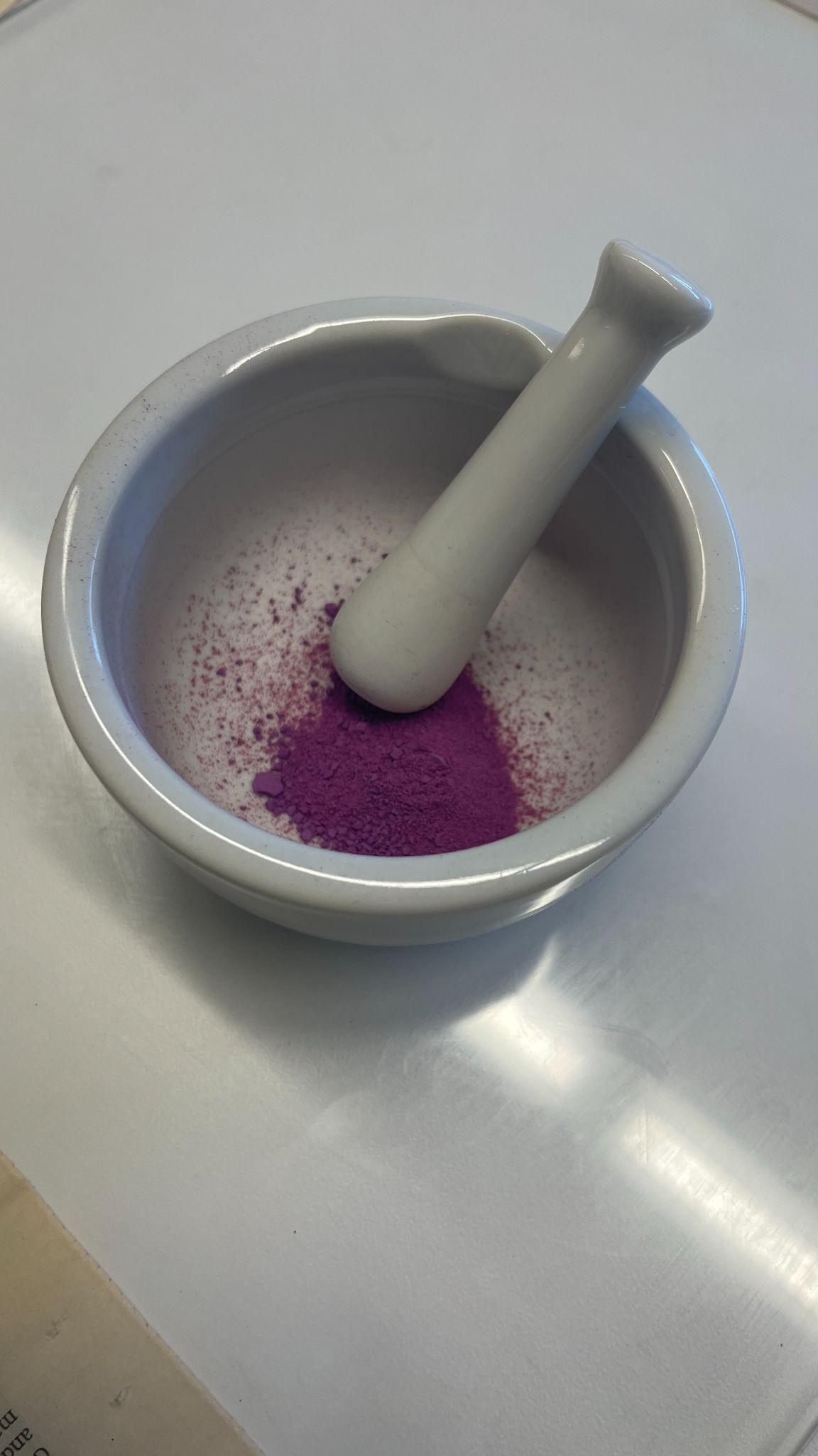 |
Step 2: Grind pigment to find powder |
|
Step 3: Place pigment on a glass plate |
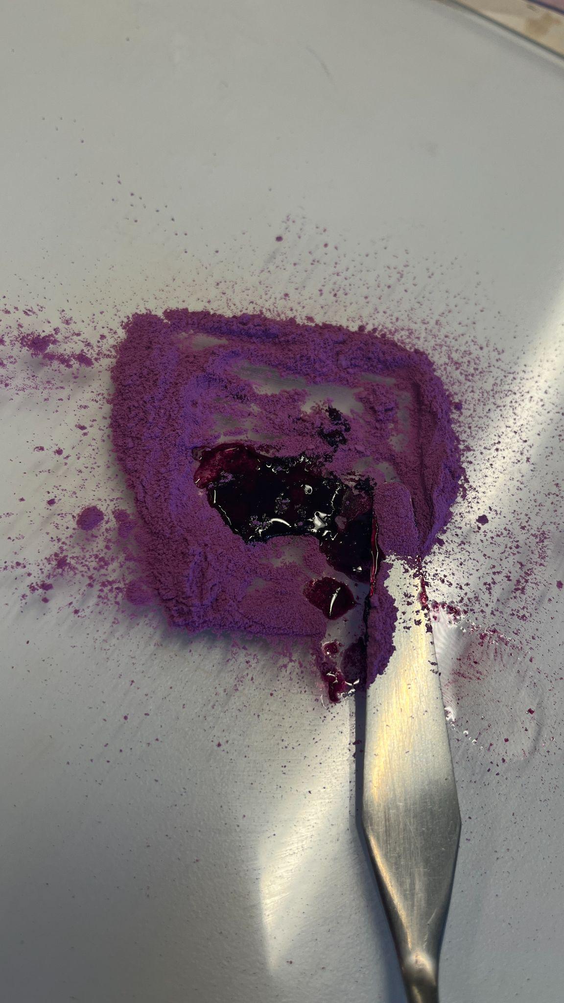 |
Step 4: Mix pigment and binder |
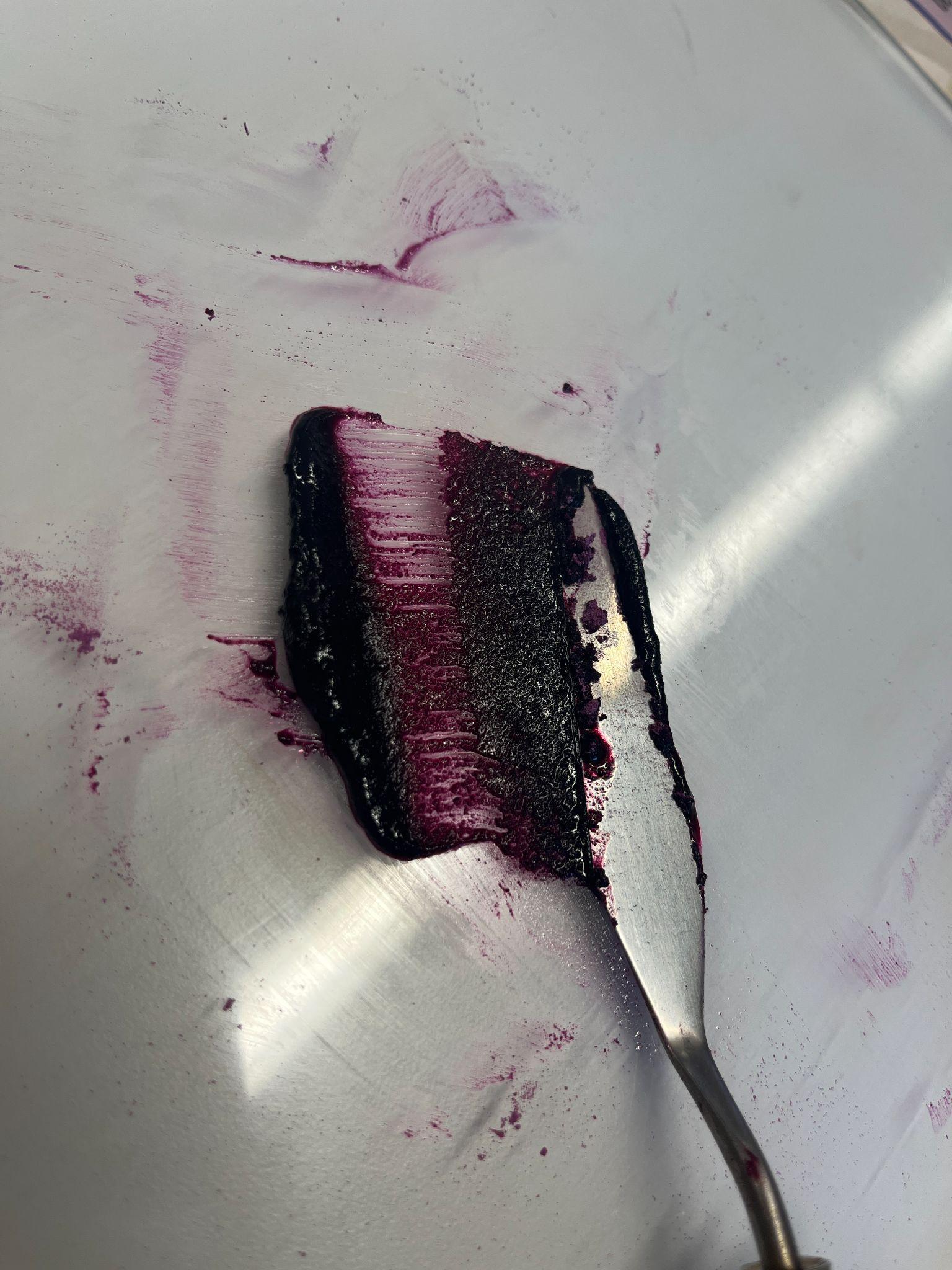 |
Step 5: Mix pigment and binder with a palette knife until roughly
incorporated |
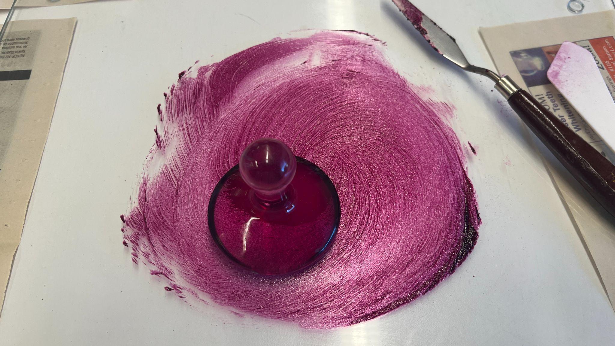 |
Step 6: Mull the mixture together |
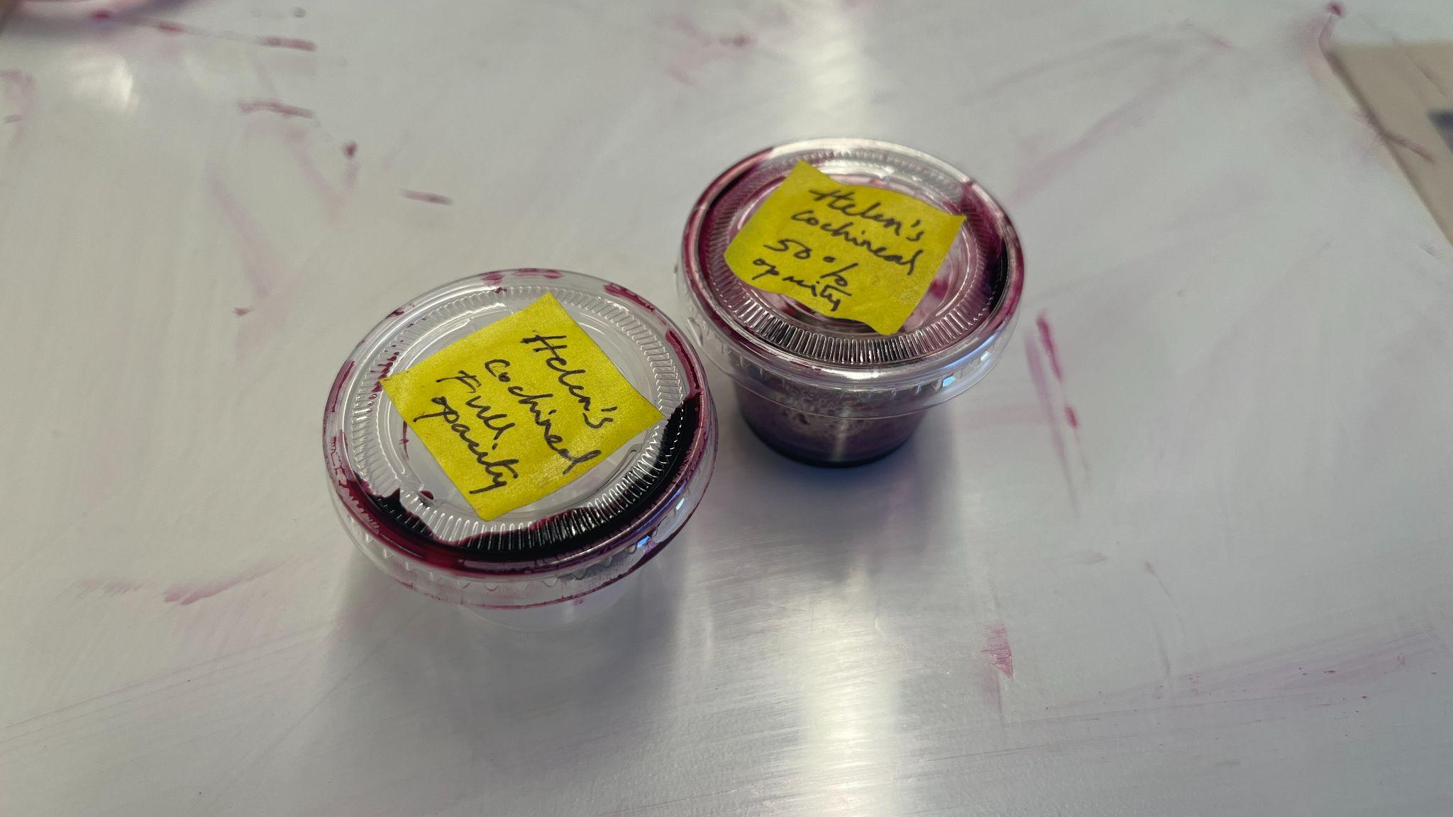 |
Step 7: Separate paint into containers |
I once again cleaned my work station with turpentine, this time taking even more care to remove all residual traces of cochineal pigment so that I had an uncontaminated station for making my azure paint.
Table 4. The process of making azurite oil paint from powdered, store-bought azurite.
| Image | Notes and Observations |
|---|---|
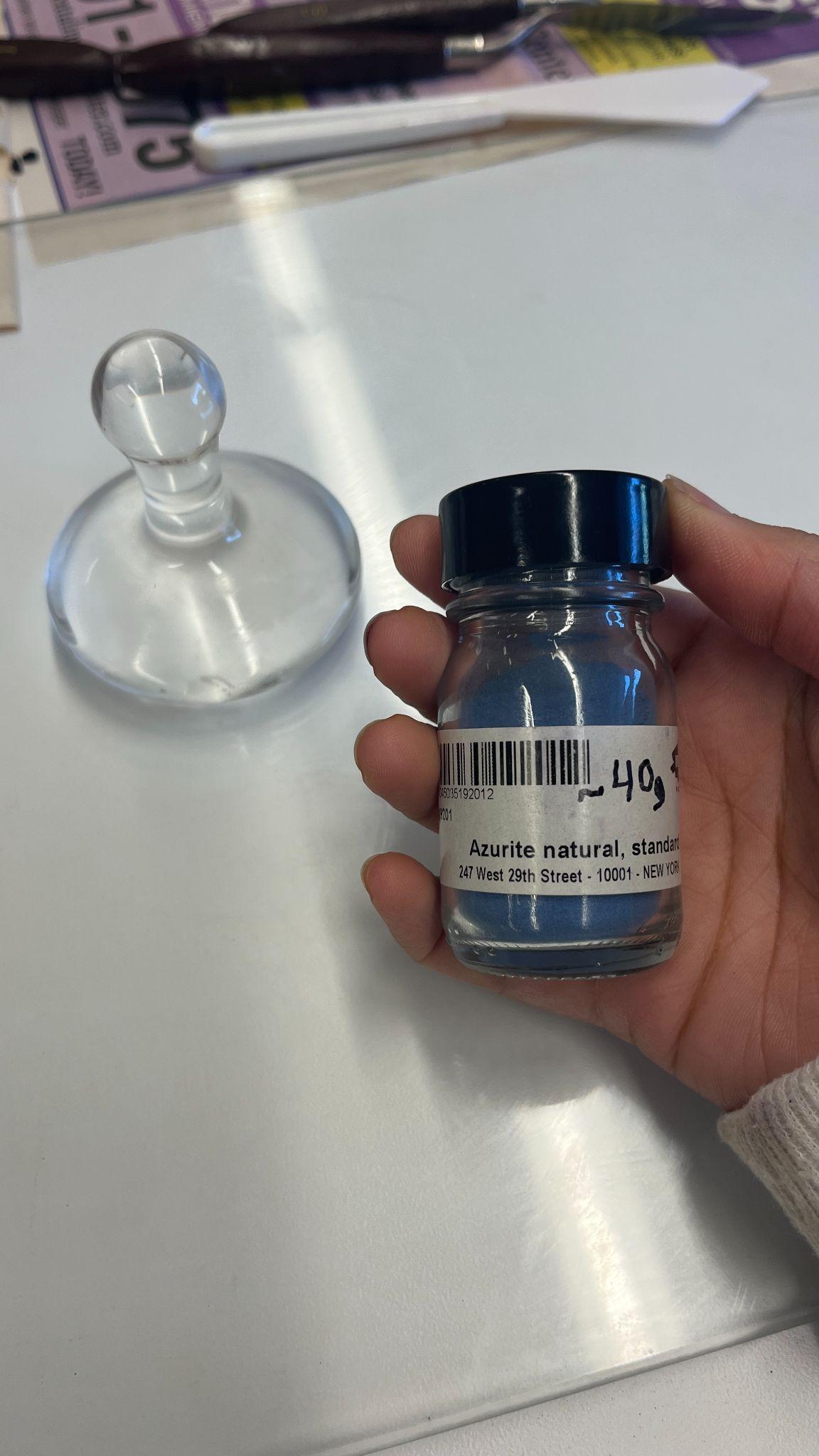 |
Step 1: Procure azureite pigment |
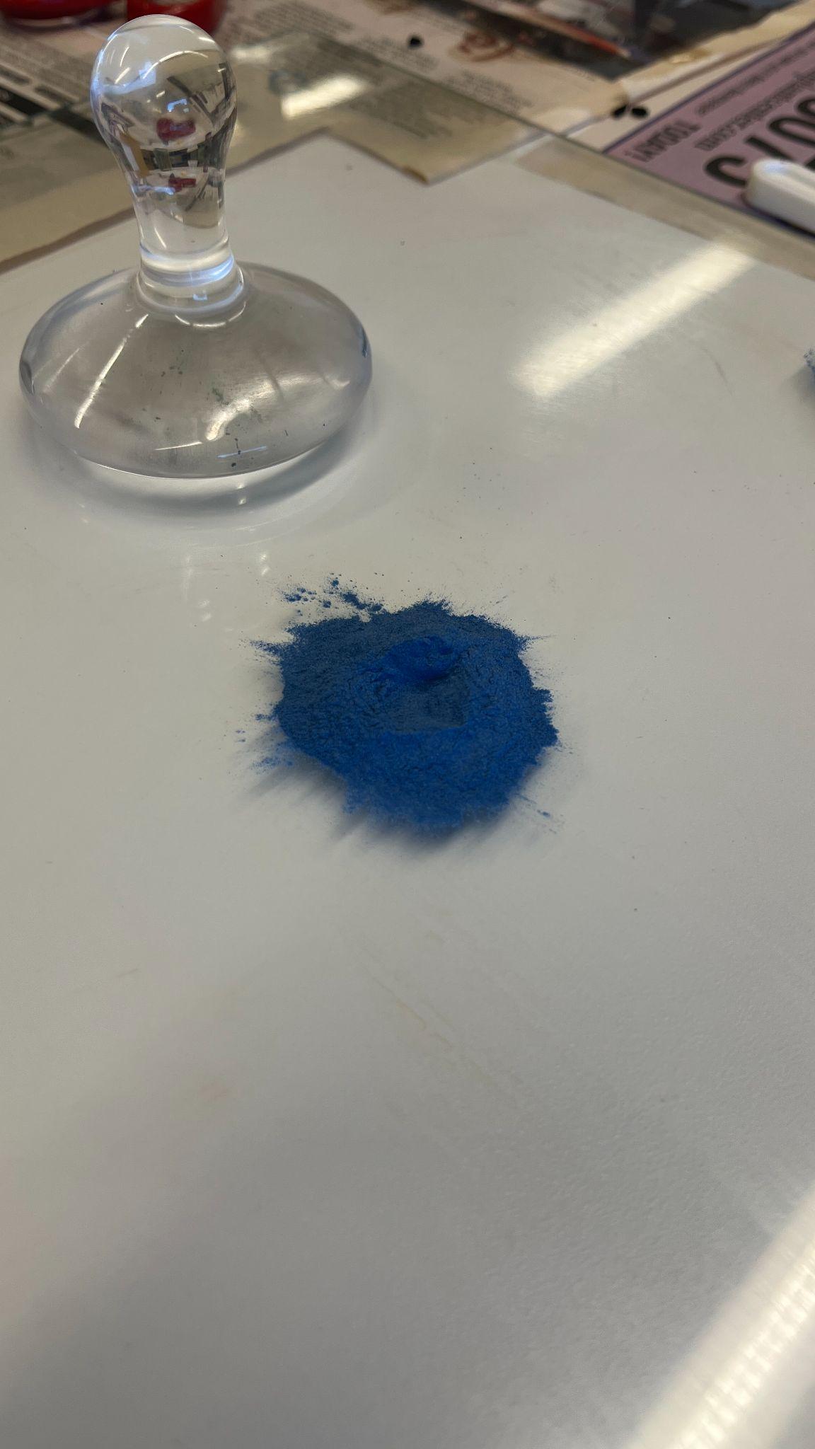 |
Step 2: Place pigment on a glass plate |
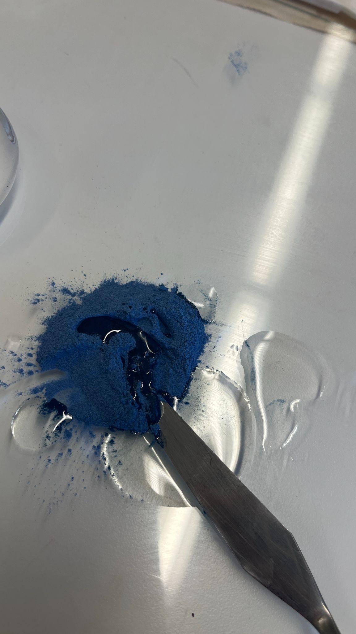 |
Step 3: Mix pigment and binder |
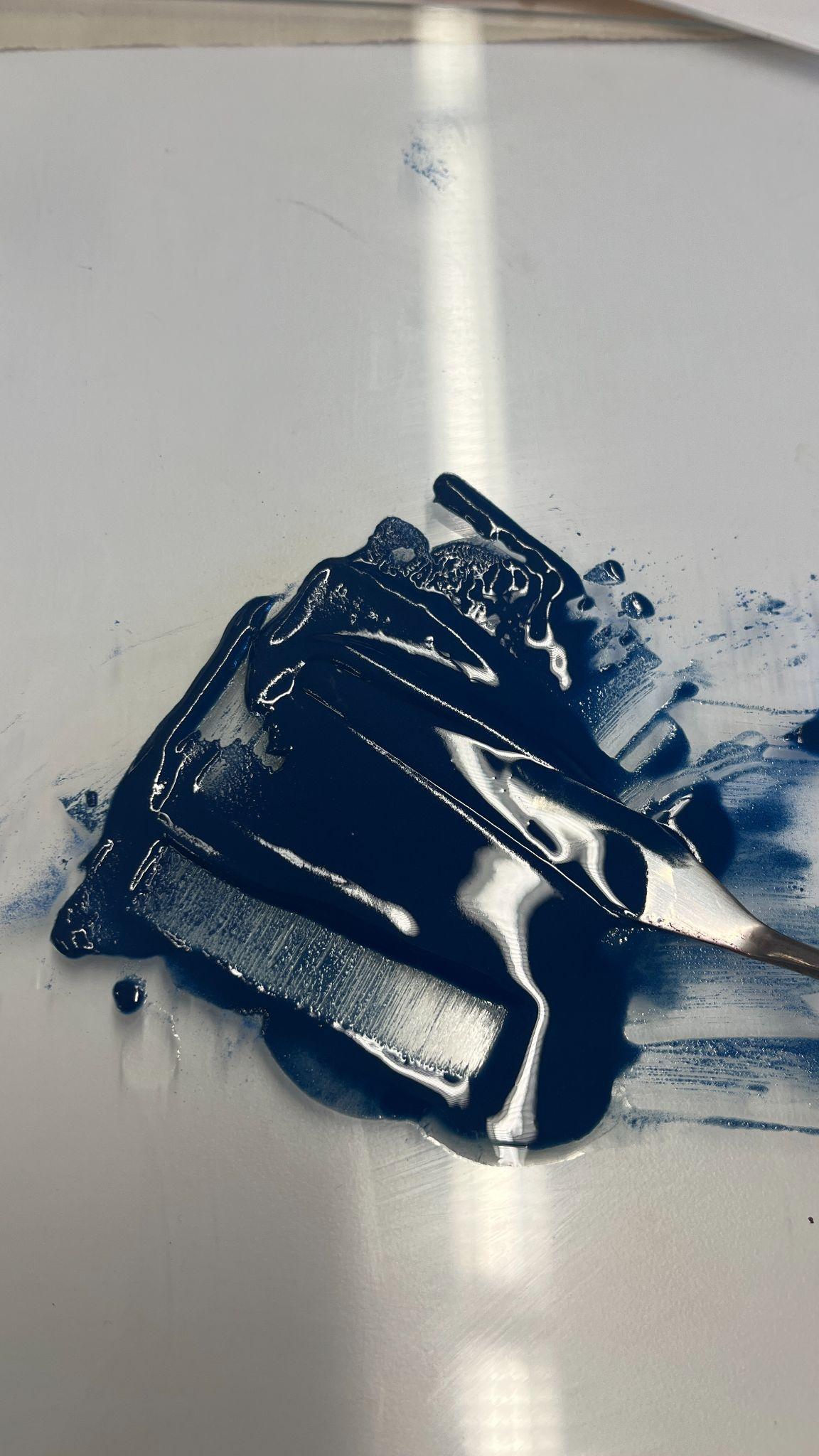 |
Step 4: Mix pigment and binder with a palette knife until roughly
incorporated |
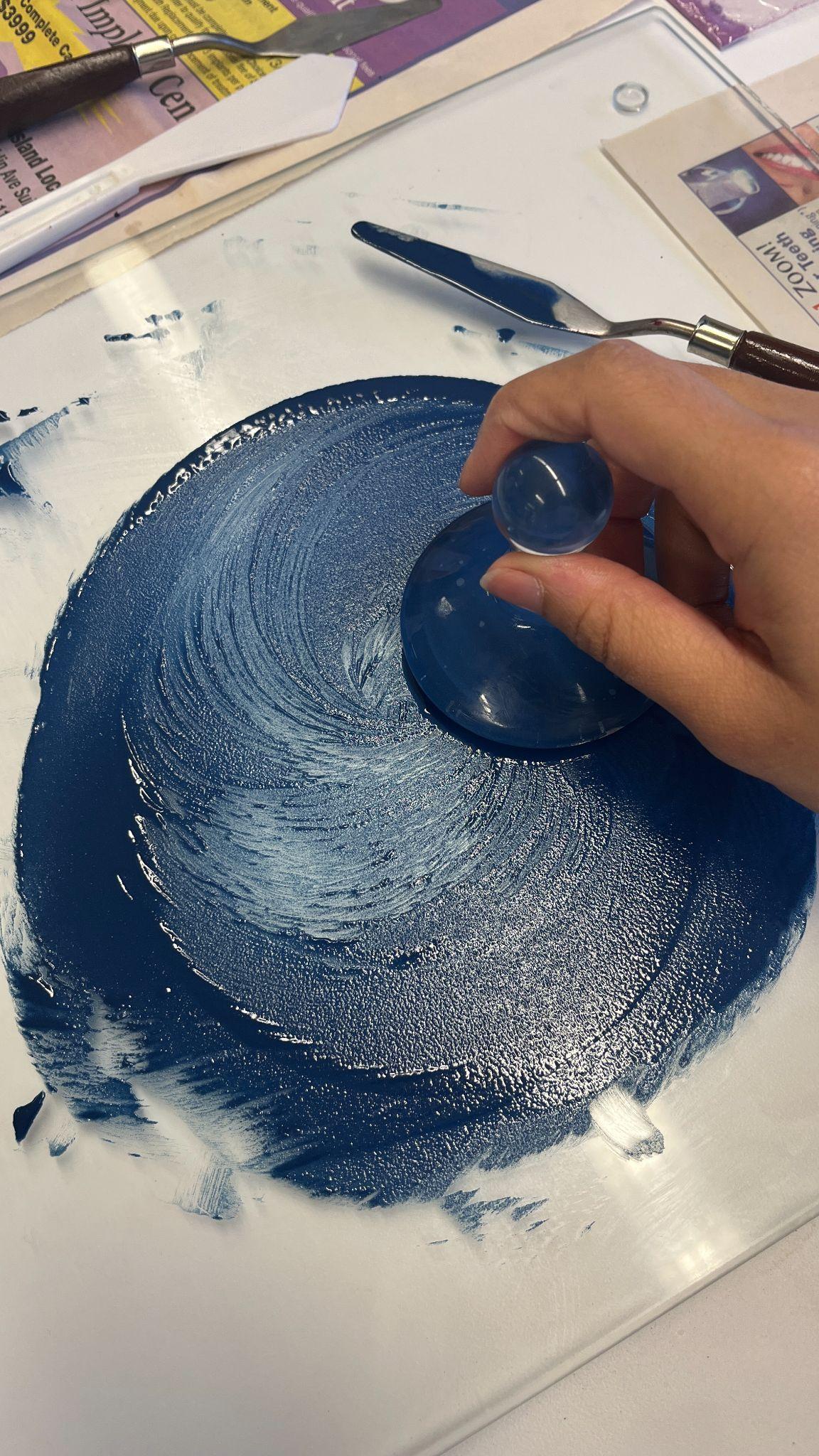 |
Step 5: Mull the mixture together |
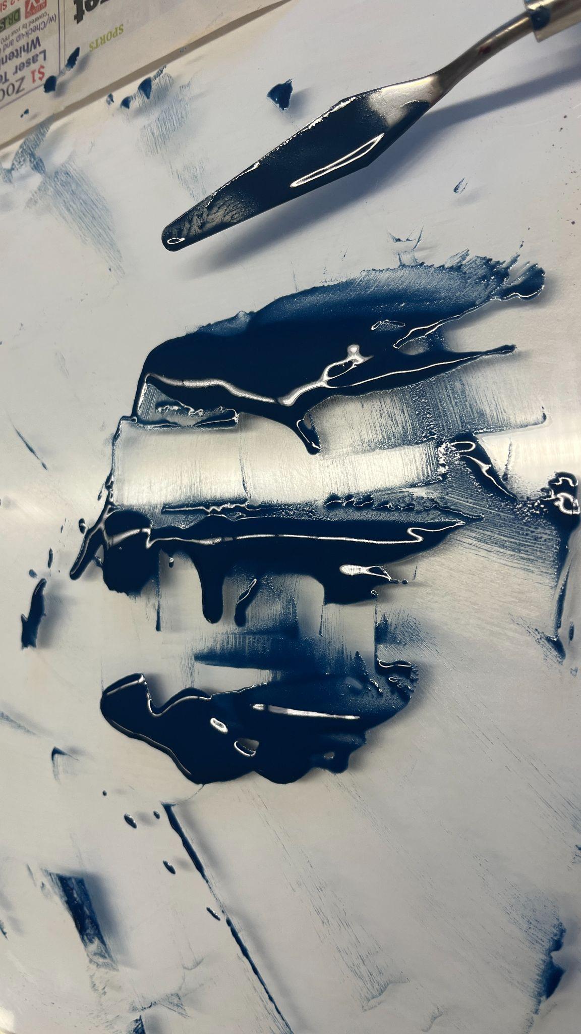 |
Step 6: Stop mulling and separate the paint into three
sections |
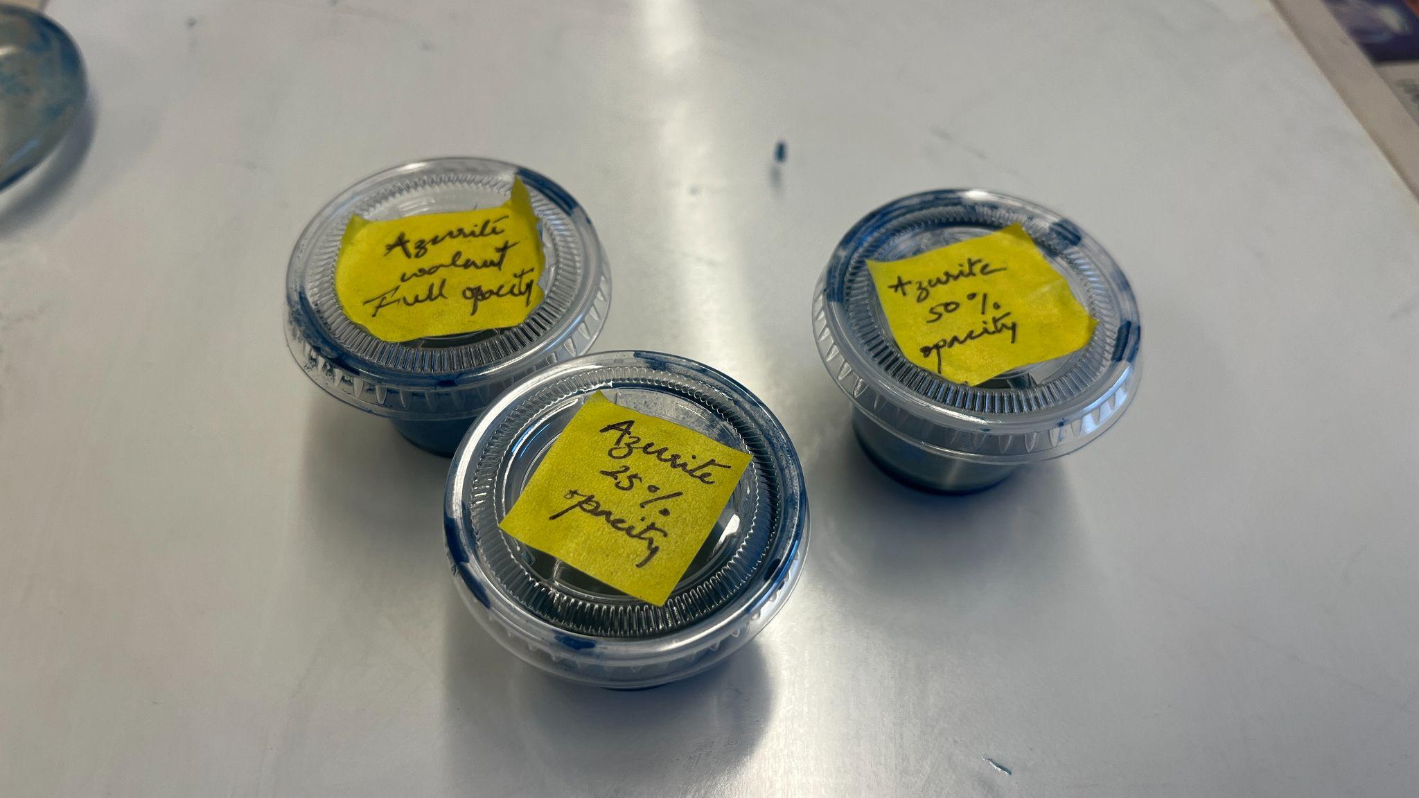 |
Step 7: Separate paint into containers |
Testing the Paint
Once I had all my paint prepared, I could begin testing them.
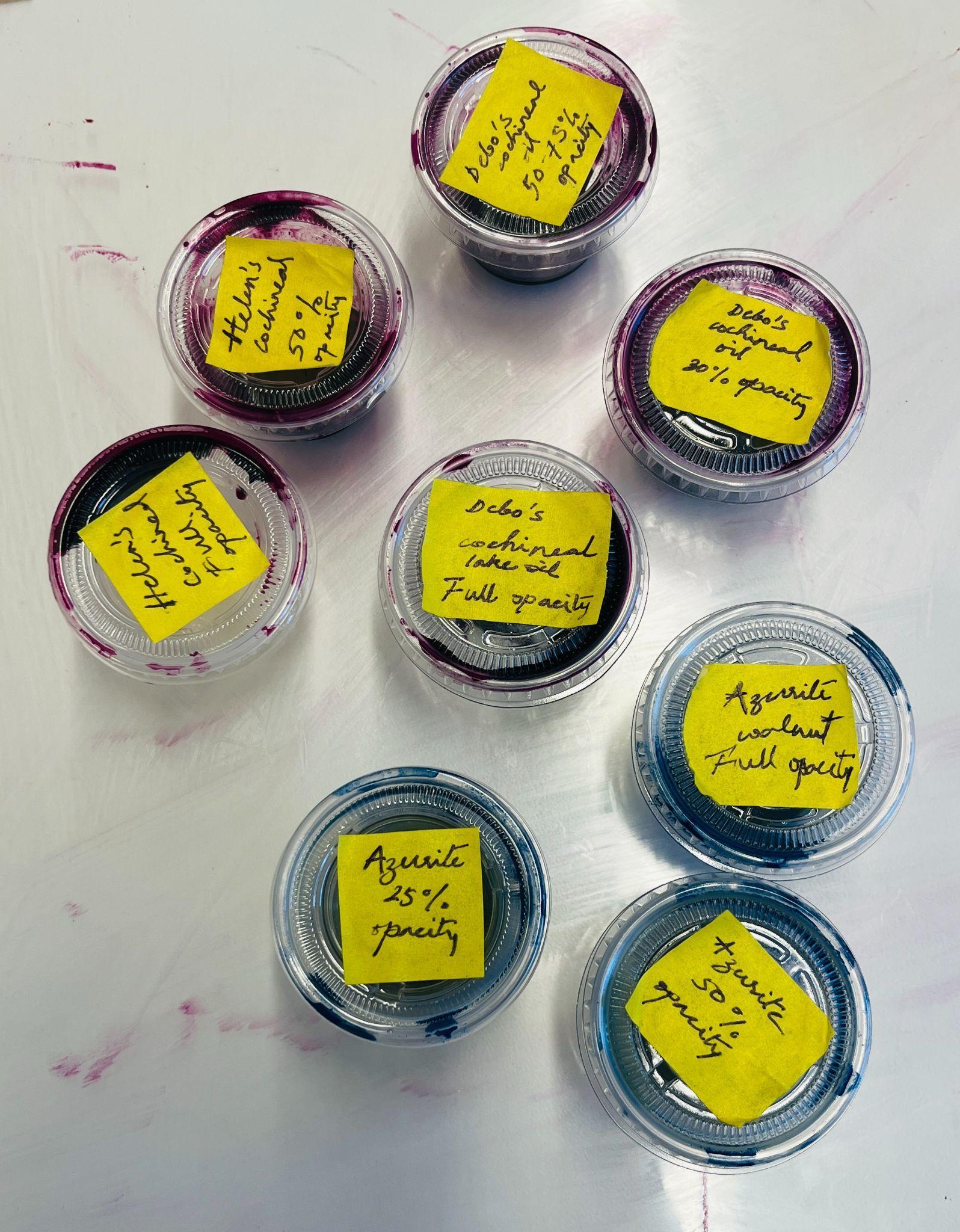
The cochineal and azurite at full opacity were to be my darkest value, and I could thin the paint to produce my lightest value. But before I could paint, I needed to understand how the layering of the glazes would work and what kind of purple they would create.
I assembled all my supplies and drew a grid on my canvas so I could add the different values of azurite on one axis, and the different values of cochineal lake to the other, and when laid on top of one another, they would produce purple.
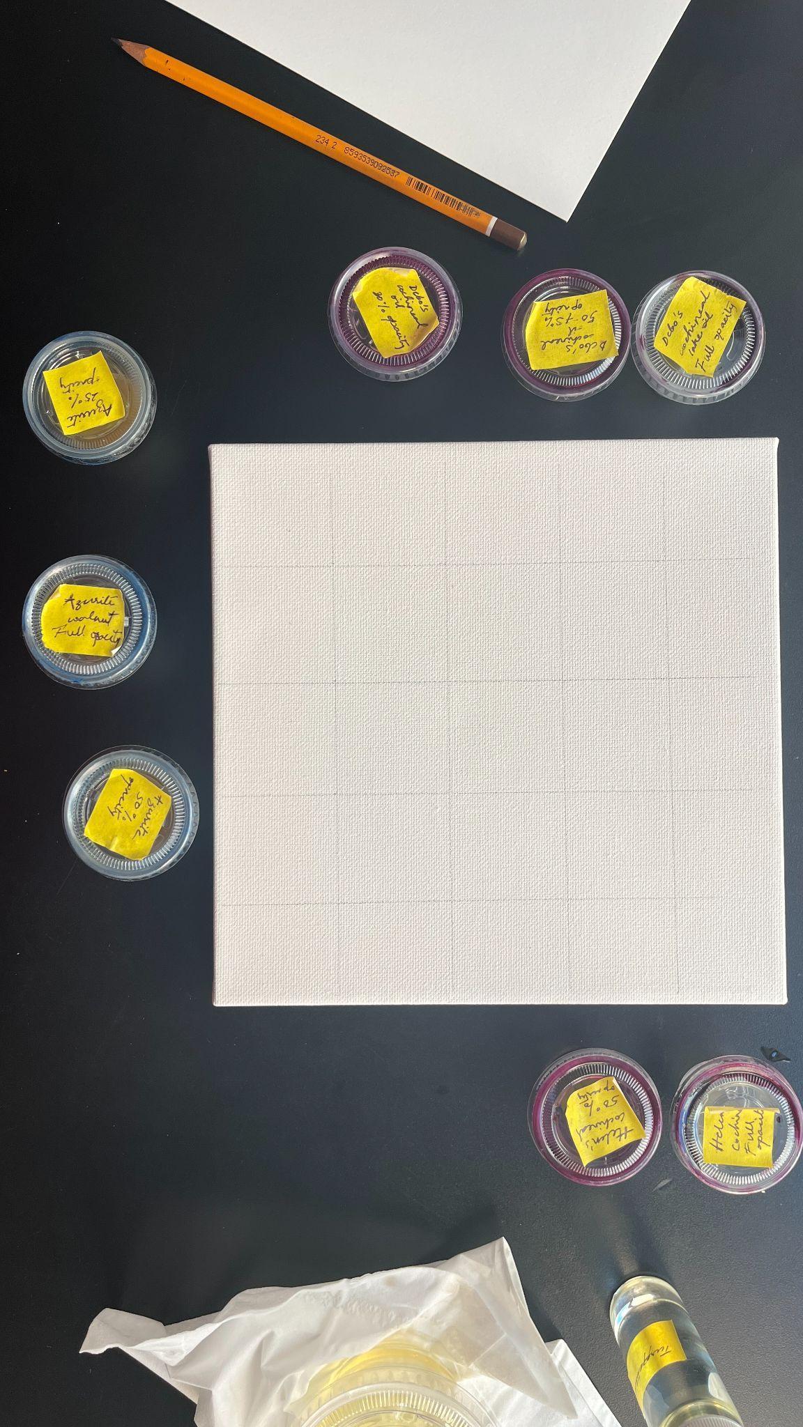
I began by adding the colors to their designated boxes on the canvas, trying to keep them separate so they wouldn’t bleed into each other.
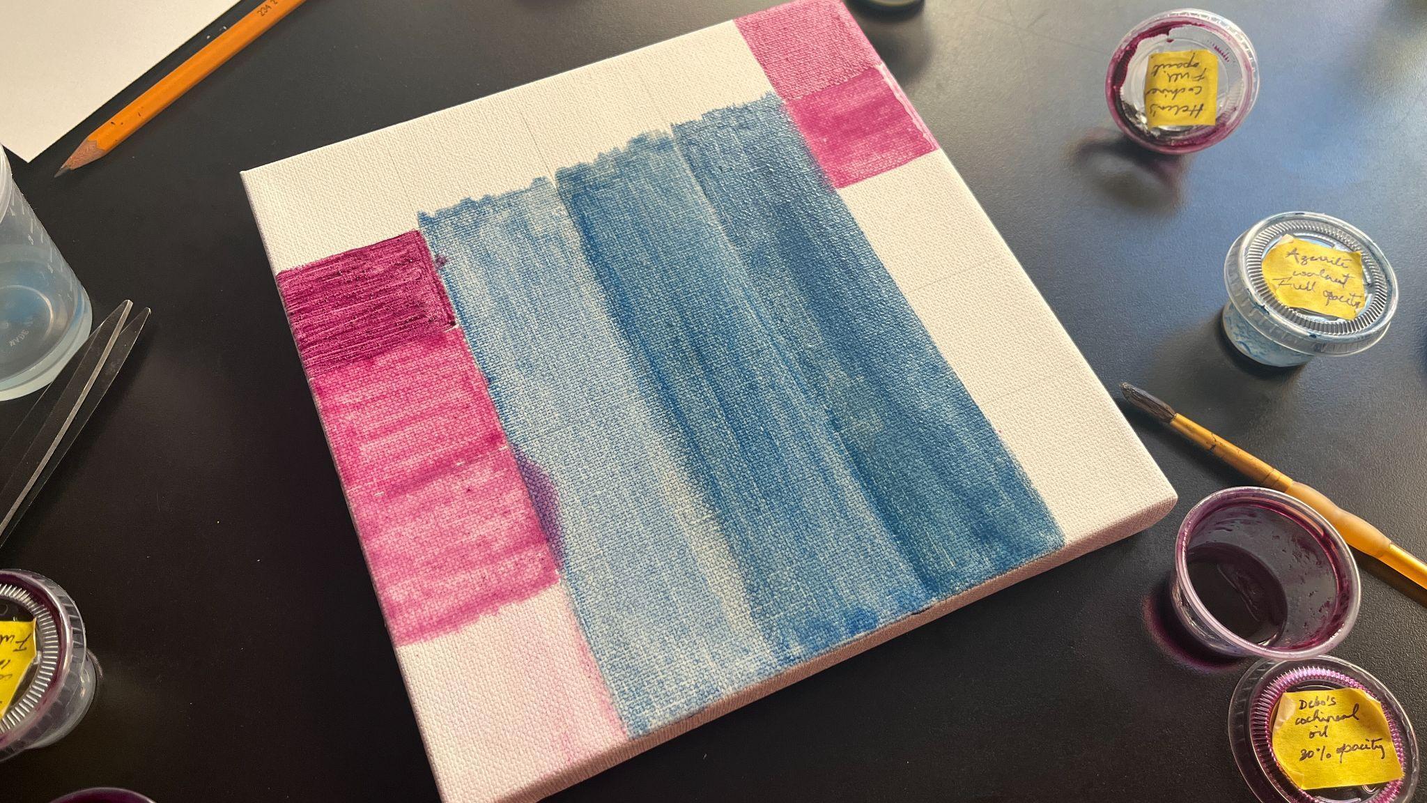
Creating this grid was much more difficult than I anticipated. Even though in the lab the paint had felt perfectly smooth to the touch, when I used a paintbrush to paint with it, its streakiness became apparent. This inhibited me from laying a flat wash of color on the canvas.
I also found that the more diluted the glaze, the more it spread and bled into neighbouring colors. At this moment, I realised that if I was to achieve any semblance of a purple created in layers, I would have to allow adequate time to pass before adding more paint to the canvas. The canvas I had chosen for this was also rather non-absorbent. While that is ideal for undiluted oil paint, when painting entirely with glazes and laying down color on a blank surface, it might have been helpful to have a more absorbent base.
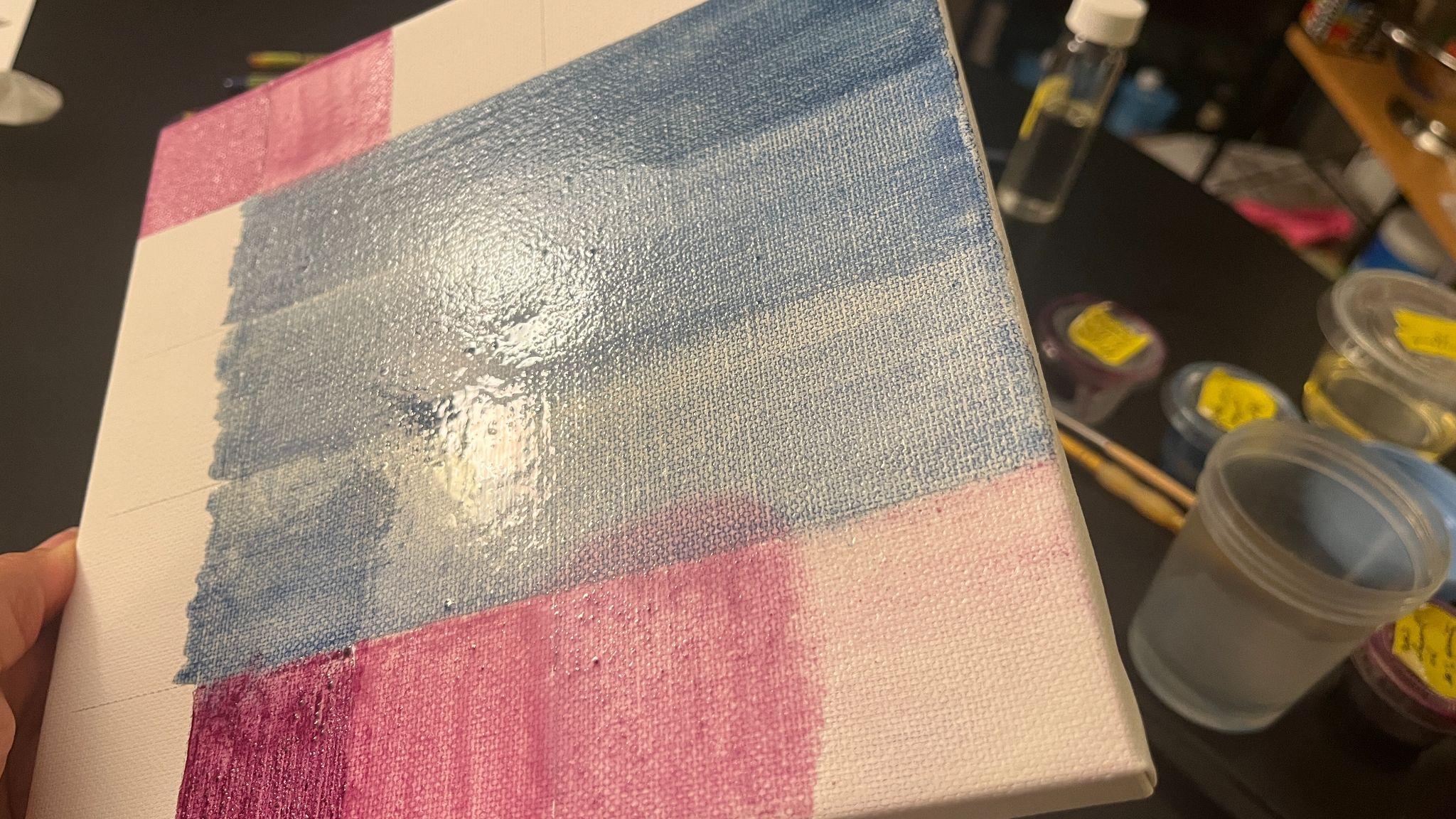
I took this picture about five hours after the glazes were applied to the canvas, and this shine told me that the paint was still very wet. It took a few days for the paint to dry fully. So, over the next few days, I waited for the shine to go down.
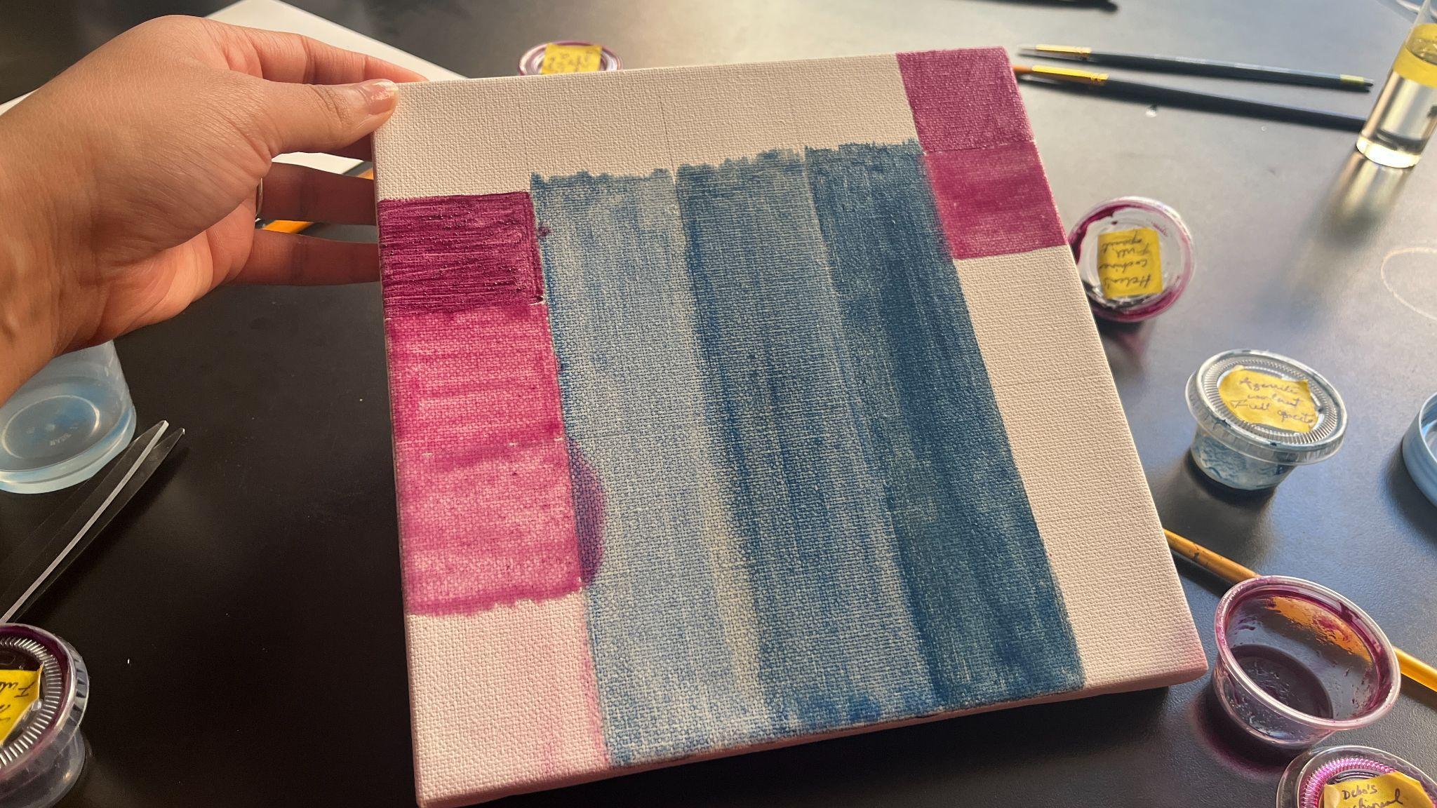
Once the paint had adequately dried, I was able to apply the next layer.
Like the initial painting, this step was deceptively difficult. The paint had appeared dry, but when I went to add the layers, I realised that only the topmost layer of the paint had dried, and with the slightest disturbance, the paint behaved as if it were wet again. So, I used the gentlest touch, almost dabbing the paint with my paintbrush and never dragging it, to achieve some results.
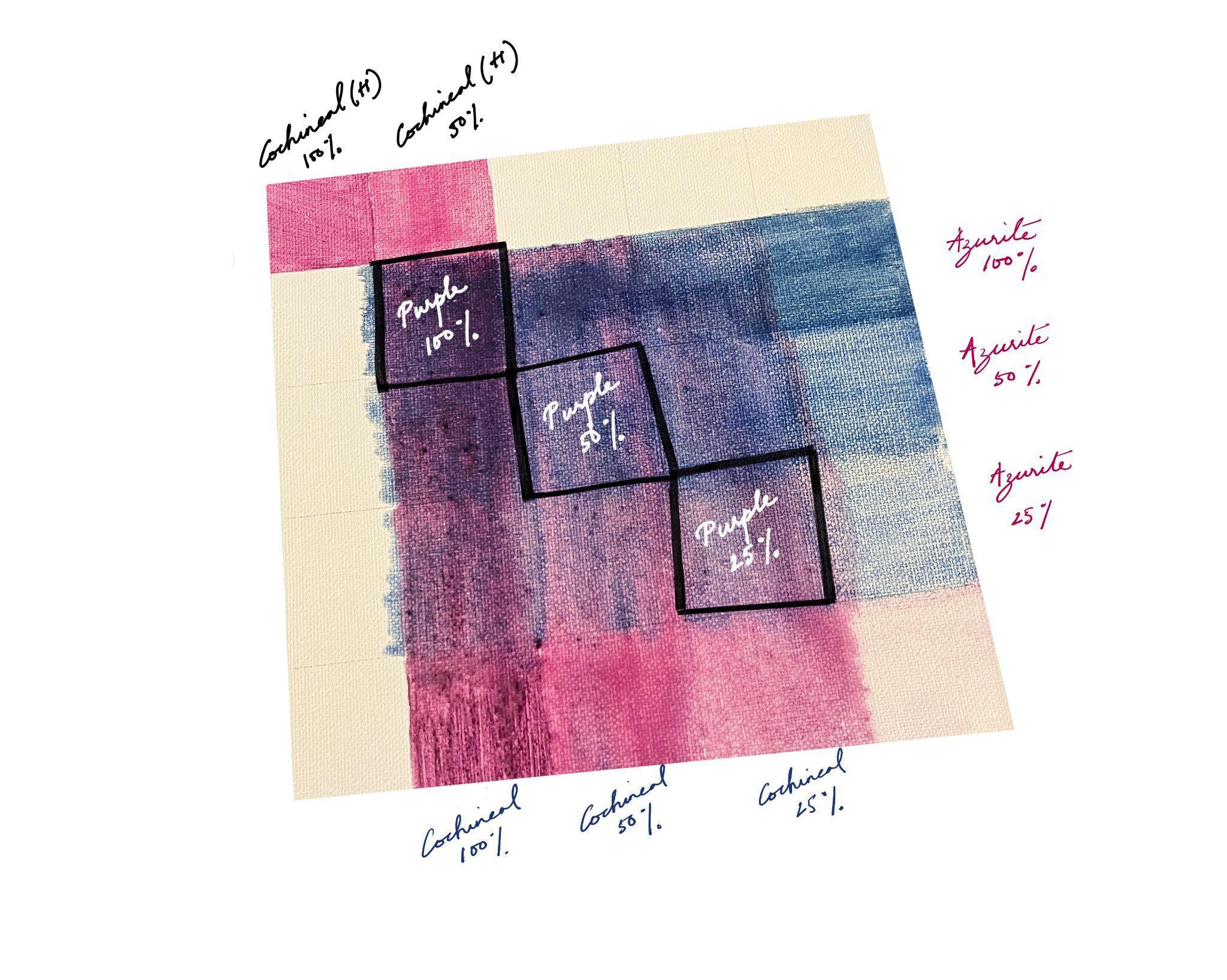
Though the markings between the shades are not as clear as I would have hoped, the chart above shows the purple values that can be created by layering azurite and cochineal lake in thin glazes.
I added the two squares of cochineal(H) swatches on top of the chart so that I had swatches for all the shades I would paint with in one place. Since cochineal(H) was my extra batch, I chose not to layer it over the azurite.
Painting with purple, but it is not purple at all
Once I had determined my darkest and lightest values and the variations I could create by altering their opacity, I could paint using these hues.
My aim at this step was not to endeavor to create the exact replica of the master image I had chosen, but to strengthen the proof-of-concept of the author-practitioner’s recipe. My reason for including this step in my historical reconstruction is that while the chart above allows us to see the different color swatches, using the swatches to paint a shape more complex than a flat square lets us test the author-practitioner’s recipe for its intended use, which is painting.
Admittedly, given the time constraints under which this project was produced, and my rusty painting skills that have not been rigorously exercised in the past two years, I adopted a few shortcuts. Namely, rather than painting in the thinnest possible layers of glazes, which would have taken considerable time to dry, I chose to paint in slightly more opaque layers, diluting the paint with a mixture of oil and the slightest bit of turpentine, rather than just oil, since turpentine is a faster drying agent. Secondly, by closely observing the portion of the Lorenzo Lotto painting I chose to recreate, I could deduce that the painter would not have limited himself to azurite, cochineal, and lead white. Instead, he would have added a range of other hues, including ochers and browns, to create the vivid textile. But, for my reconstruction, I chose to limit my palette to cochineal and azurite at different opacities, and I only added lead white to the parts of the sleeve that are white in the reference image.
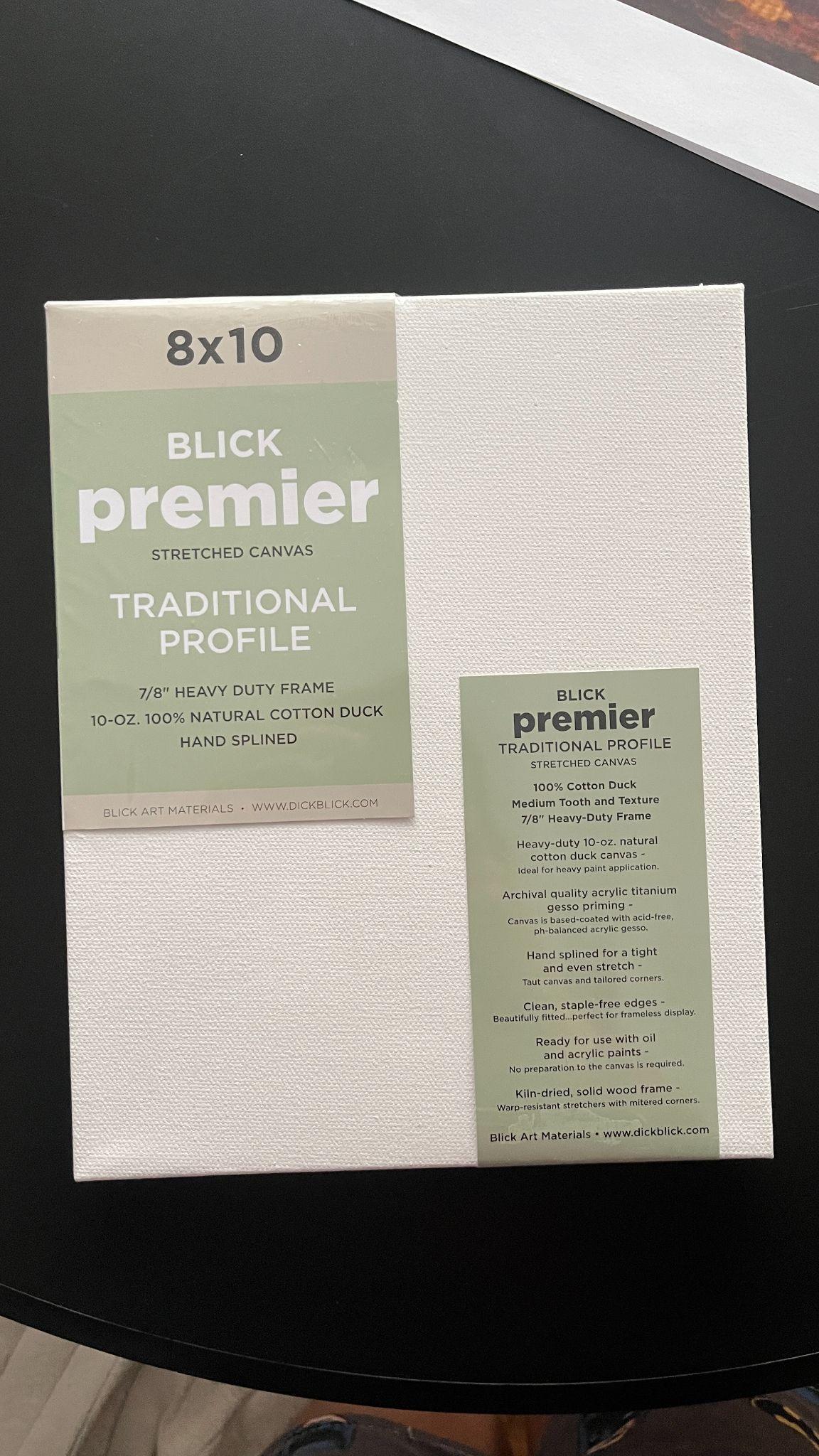
For my painting reconstruction, I chose this store-bought, prepared canvas from Blick in New York. This canvas was more expensive and of better quality than the canvas I used to create my swatches. This improved quality certainly made a positive difference, as it absorbed the glazes much better and prevented them from bleeding.
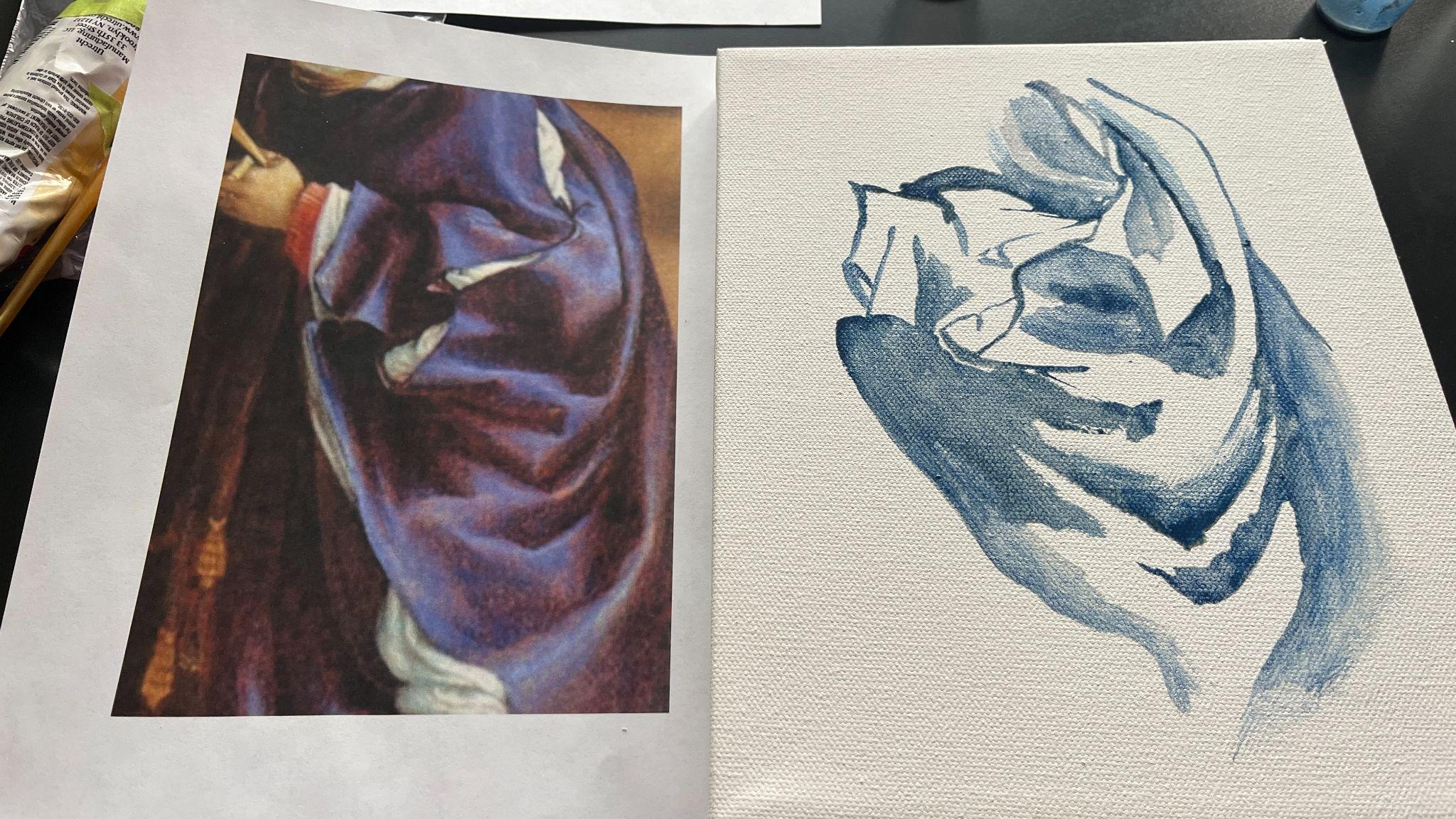
To recreate the purple cloth from the painting, I printed out a reference image and began my process by first laying down my darkest azurite value, taking great care to leave the lightest areas blank for the moment.
I could have begun with the lightest shade, but I chose to begin with the darkest for three reasons:
-
I was certain that the darkest azurite paint would be the quickest to dry and be absorbed by the canvas.
-
Conversely, I was unsure of how much the lightest glaze would spread and how long it would take to dry.
-
From my experience with painting, I knew that marking areas of darkness would create artificial contours, preventing the thin glazes from bleeding too much outside of these borders.
I was very light-handed with this application because I knew I would have to reapply the paint to darken the areas that would appear lighter as soon as I filled in the negative spaces in between.
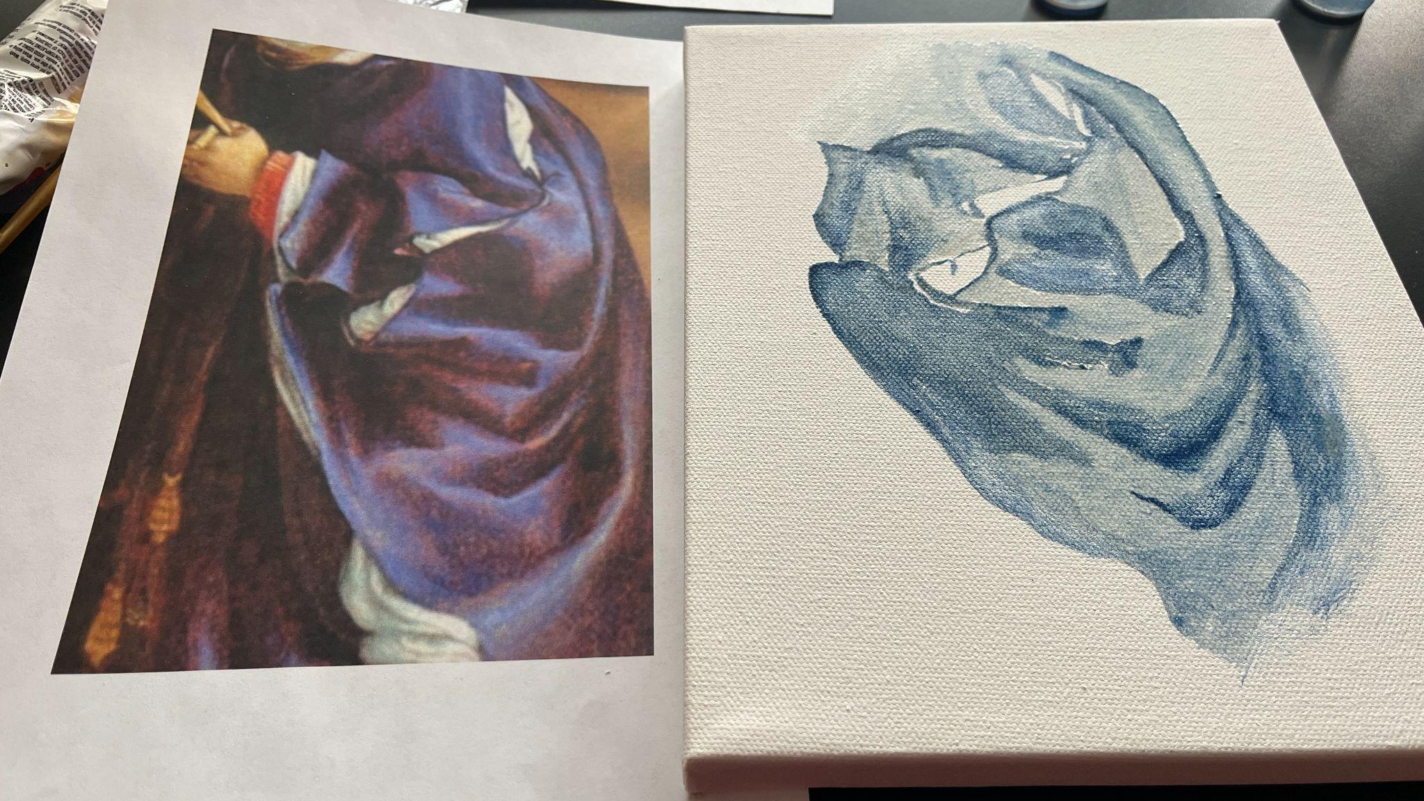
Once I had marked my darkest areas, I then went in with my 50% and 25%
glaze to fill in the blank spaces.
Just as I had predicted, filling in the negative spaces allowed me to
see that the contrast between my dark and light areas was not as stark
as in the master image.
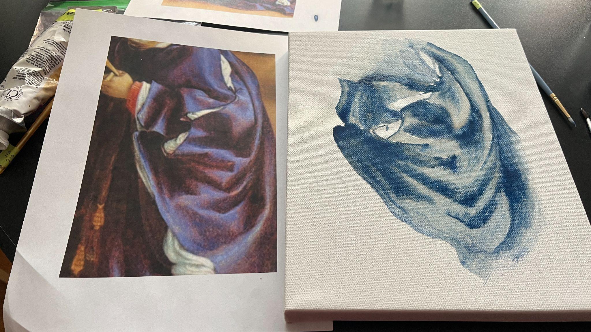
So, I reapplied the full-bodied azurite paint in the darkest areas. And, even without adding any other color to darken or lighten the paint, it was rewarding to see the cloth appear three-dimensional at this early stage.
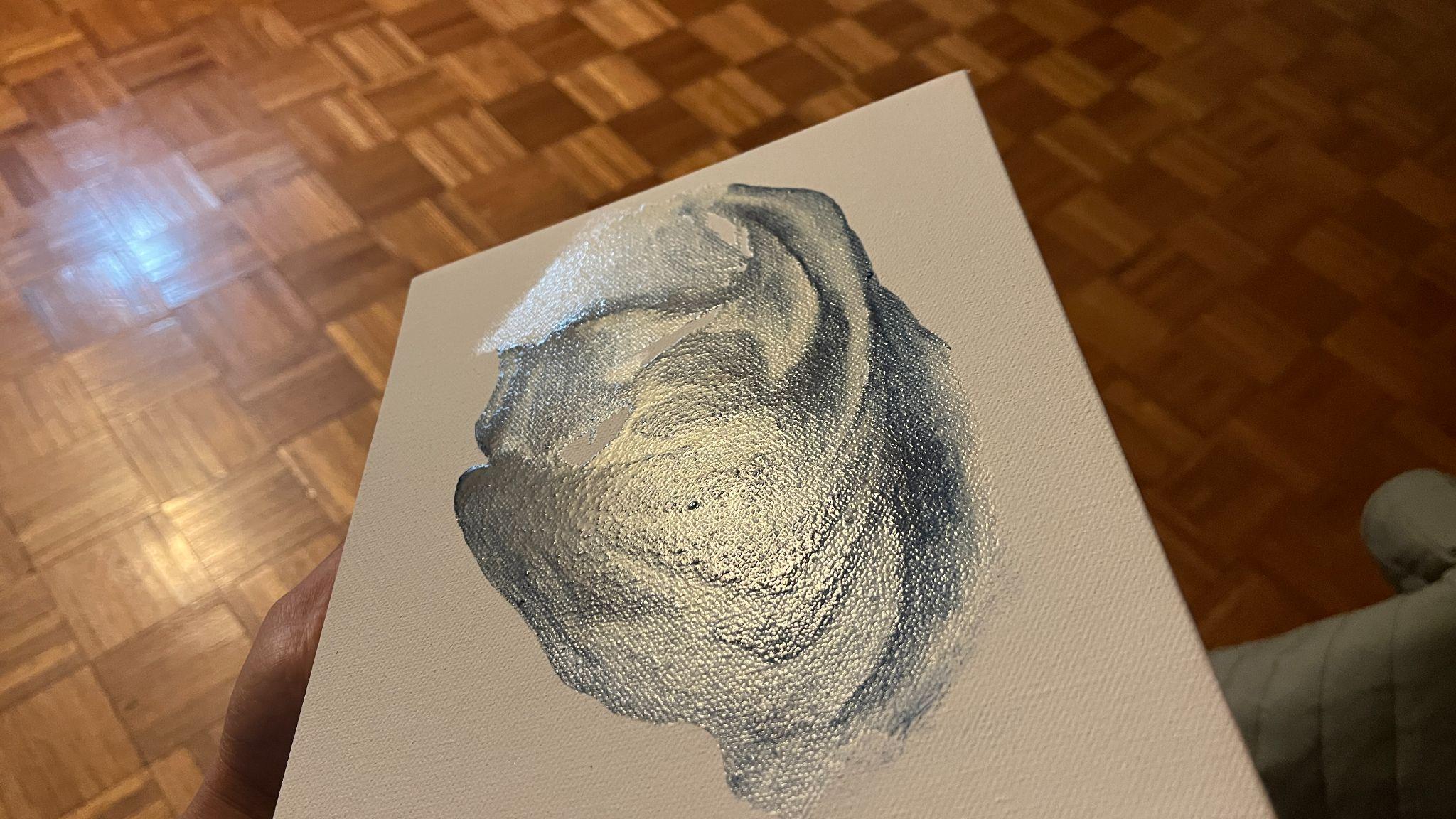
The canvas was incredibly glossy and wet when I finished this step, and I had to wait a whole week before I could attempt to add the cochineal paint and glaze on top. I also had to ensure that I kept the canvas lying flat at all times, otherwise there was a risk of the glaze running down the canvas.
Painting with azurite glaze was challenging, exactly as Marjolijn Bol has noted:
…azurite is a challenging glazing pigment…To preserve its color, azurite must retain a certain particle size. When ground too fine it turns pale, almost gray. Paints made from azurite therefore tend to be rather gritty. And particles protruding from the painted surface cause the visible light to scatter, reducing potential color saturation and translucency.30
The author-practitioner has also recorded this property of azurite and suggested using turpentine to help the binding oil adhere better to the pigment on fol. 61v of Ms. Fr. 640:
Azur d’esmail in oil
One needs to choose the most
beautifuldelicate that will be possible, for if it is coarse one cannot work with it in oil. And if you do not find any that is subtle enough, you can grind it well, not with water but with oil, & grind it thickly. Next lay it on your palette & mix in a little turpentine, but hardly any, to give it bond, and make it so that it is thick like butter or mortar, & then, with a fairly large paintbrush, work it by always moving the paintbrush back and forth. Then, to soften it, hatch across it in a tooth-like jagging withthethe tip of the paintbrush. The highlights will be made withdthe same thinned with ceruse, which, giving it bond, makes it easier to work. I have seen it used thus. It must be very thick, & almost such that you are at pains to spread it with the paintbrush. And it is all the better if you lay down your panel. All these difficulties do not arise when it is very subtle & thin without being ground, and does not run.
As mentioned previously in the essay, the above entry helped me justify my choice of using pine gum spirit turpentine for my historical reconstruction.
After a week, when I first attempted to add the cochineal glaze because the azurite glaze seemed adequately dry, the glaze was displaced as soon as I applied any pressure with my paintbrush. So, I set the canvas aside. Marjolijn Bol says that “even though the oil may be touch-dry in a few days, depending on the oil used and its preparation, complete drying may take many years.”31 Since I did not have that much time, I waited for a few more days and then added the cochineal glaze over the azurite.
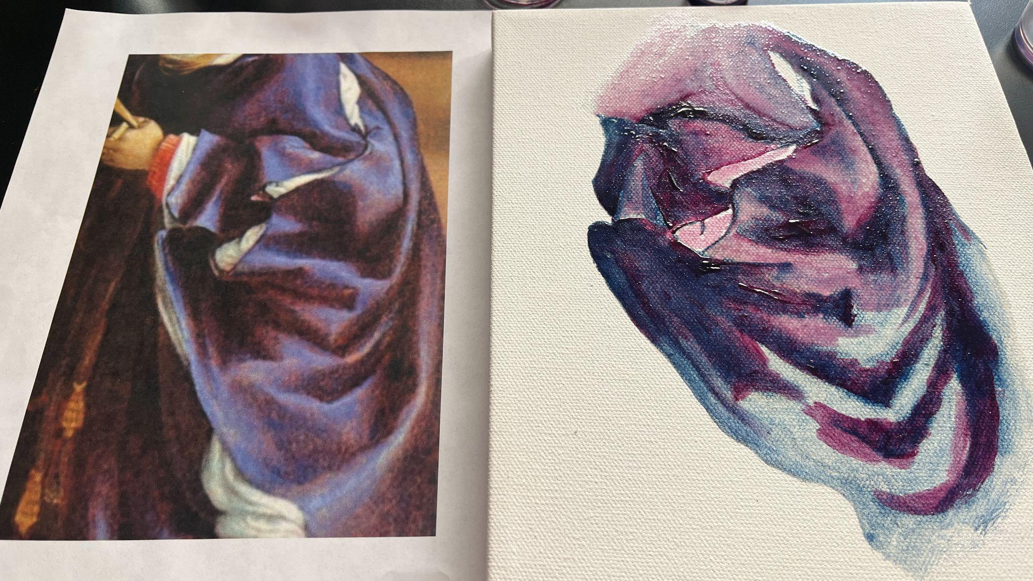
Just as I had with the azurite, I first added my darkest value of cochineal red and then applied the lighter glazes in thin layers. In contrast to the gritty texture of the azurite paint, the cochineal paint was remarkably smoother, and painting with it was a delightful, buttery experience. The semi-dry azurite also proved to be an advantage at this stage, as it allowed me to partially blend the two glazes together on the canvas without disturbing the structure and contours of the cloth that had been marked by the first layers of paint that the canvas had already absorbed.
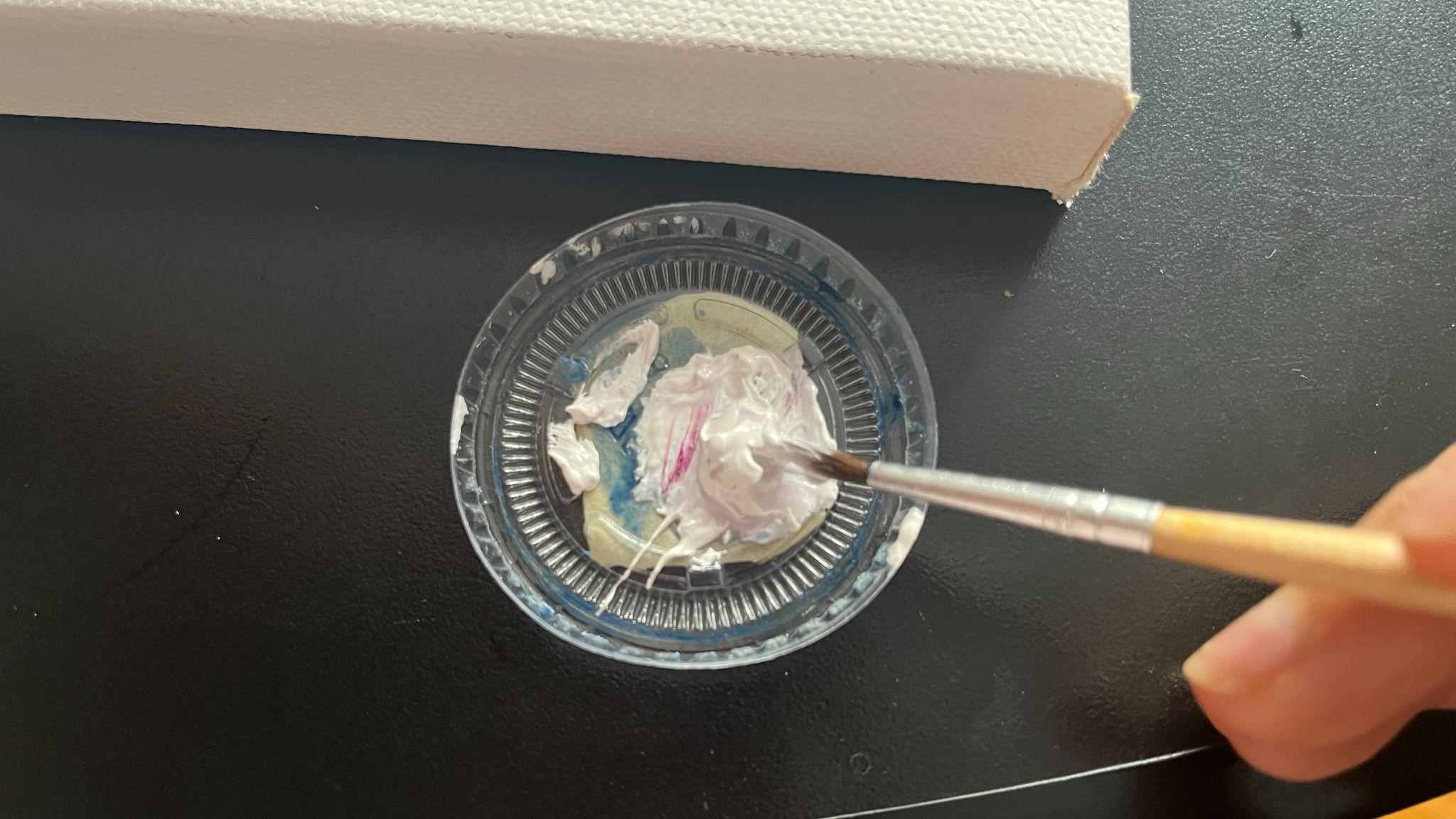
Once I completed the steps for laying the glazes, I added lead white to the white portions of the sleeves as seen in the master image. As I was no longer going to use the brushes I had reserved for azurite and cochineal, I dipped them into the lead white paint to add more dimension to the areas where this color was applied.
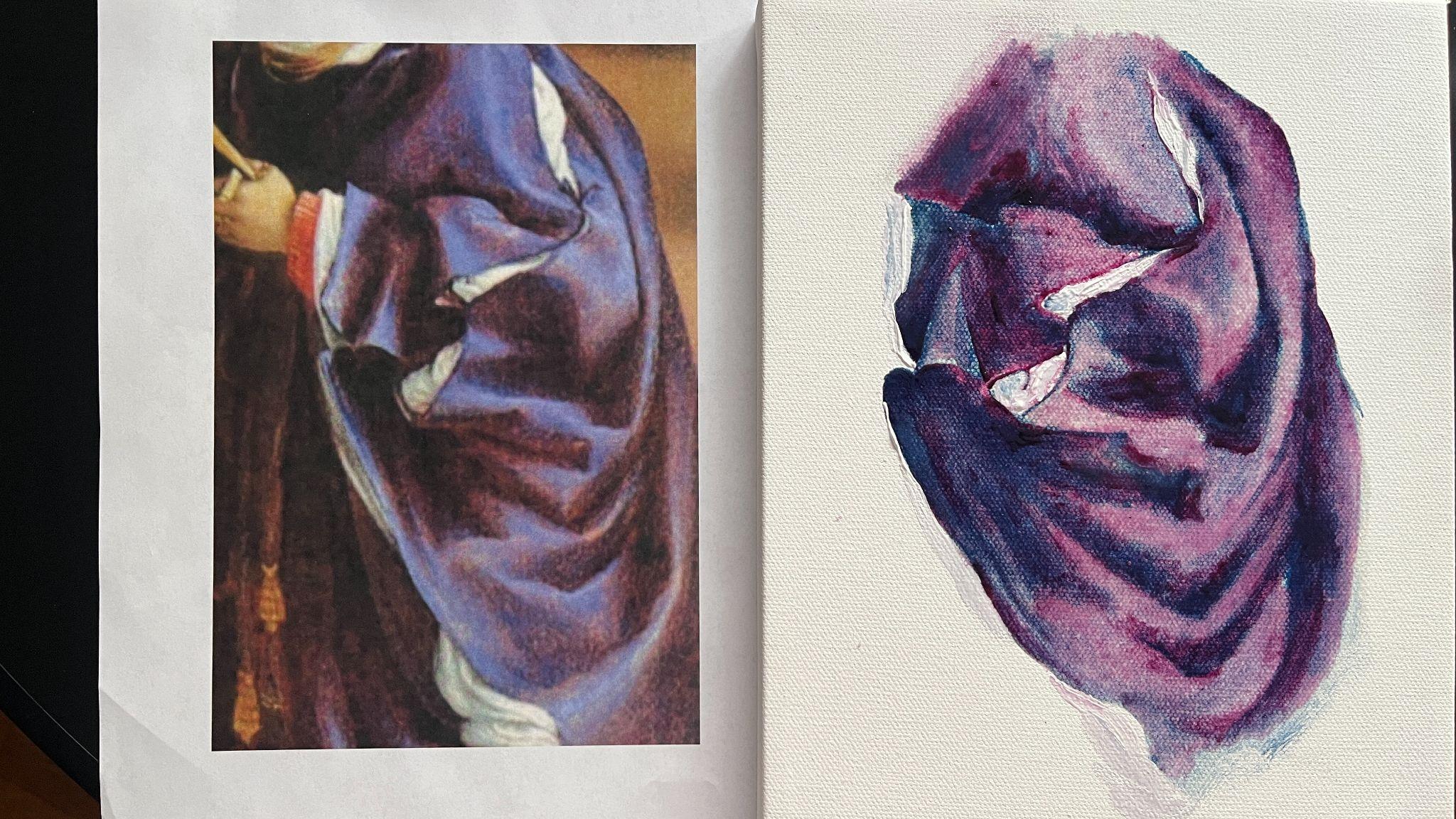
Immediately upon completion, this is what my canvas looked like, next to the master image.
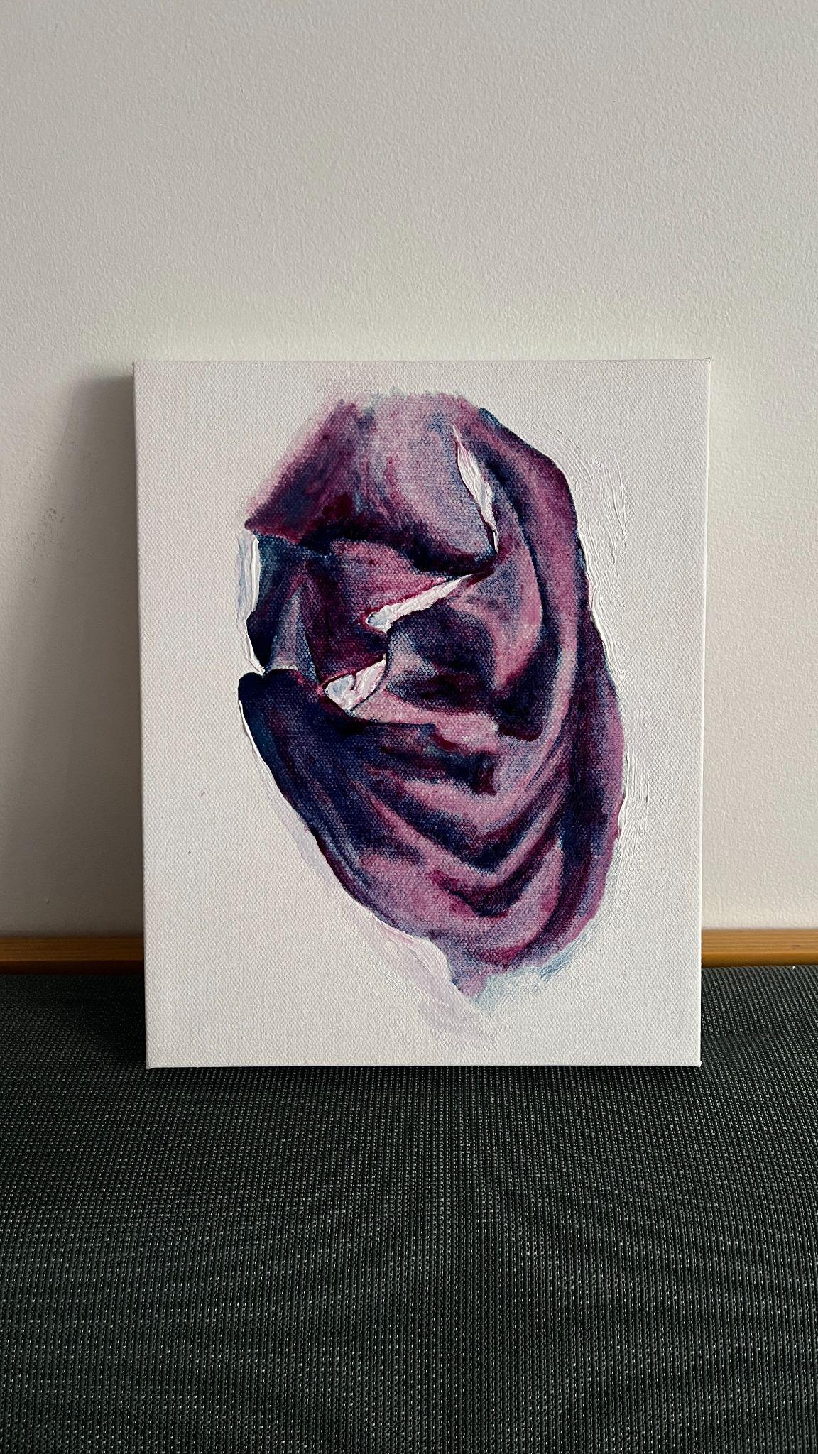
I let the canvas dry slightly before photographing again. Once the glazes had had a few days to dry, the purple color and contrasts appeared to have intensified.
Conclusion
Admittedly, I am really delighted and pleasantly surprised by how effectively the author-practitioner’s recipe for purple worked. I would posit that this historical reconstruction provides undeniable proof-of-concept for the purple recipe on fol. 10r of Ms. Fr. 640. Even though the canvas I painted for the historical reconstruction has a single layer of azurite and cochineal glaze, along with areas where the paint has been applied at full opacity, the purple of the textile is clear. And, one can imagine how much richer the color would be if the glazes were applied in even thinner layers in a slower process and with more skill and dexterity. Cleo Nisse also came to a similar conclusion in her essay “Shadows Beneath the Skin,” where she writes that the progress she made in her reconstruction “indicates the method would become more effective and successful over time as one’s skills improved.”32
Even as I made a deliberate attempt to find substantial evidence for the choices I made for my reconstruction, my report above indicates just how much I had to draw from my previous training in oil painting. Due of the lack of measurements or quantities in the recipe, relying on my experience was especially important for knowing how much binder was adequate to turn dry pigment into paint, how much to thin a full-bodied paint to make glazes, and how to be attentive to the materials I was working with because each behaved in a manner particular to itself. This kind of engagement is demanded by the author-practitioner, as was also acknowledged by Cindy Kok while working on the color for green leaves in the manuscript. She writes, “as in other color making recipes, there is an expectation that other practitioners will adjust and experiment, tailoring the recipe to their own needs.”33
It is also worth noting that the recipe worked so much better when I painted something with it, rather than just creating color swatches. This leads me to conclude that using the recipe for its intended purpose yielded far better and desirable results. The quality of the professional-grade canvas used for the second stage of the historical reconstruction also significantly contributed to the success of this experiment.
However, the process of painting in layers described above was counterintuitive to how I had learnt to paint with oils. One of the joys of oil painting, my teacher had told me, is that one can paint simultaneously with light and dark shades to build well-rounded forms. Because of its slow drying nature, oil also allows painters to repeat this process, layer after layer, to create paintings with incredible depth. I had also learnt that thin glazes are applied once a local color34 and basic shading have already been laid down—glazing was to be done more towards the completion of the painting, not at the first stages. Conversely, it is for watercolours, and sometimes for gouache or even acrylics, that one has to wait for the paint to dry in between layers. As a result, one has to begin with the lightest shades, slowly adding more depth in layers because once a color has been applied and dried, it can only be darkened. Therefore, for my reconstruction, even though I was painting with oil, I had to essentially adopt a method for watercolors. This really compelled me to resist my urge to go in with all my shades at once, blending my paint not just on my palette but also on the canvas. It was also cumbersome to keep the two glazes separate. I assume the time it took me to paint my canvas might have been cut in half had the author-practitioner’s recipe called for mixing azurite and cochineal together and making paint and glazes with the resulting purple mixture. This is what leads me to agree with other scholars when they point out the author-practitioner’s relative unfamiliarity with painting as a medium and as a practice. His recipe for purple on fol. 10r undoubtedly demonstrates his awareness of the process, but my historical reconstruction report indicates that his awareness might have been, at some level, perfunctory.
Nevertheless, I am impressed by how much “missing” detail from the recipe for purple on fol. 10r I could find from other recipes in the manuscript, and how much additional information other entries in Ms. Fr. 640 provided to enrich my understanding of a single recipe. This is a testament to the author-practitioner’s astute observational skills and certainly speaks to his caliber as a craftsman.
Bibliography
Making and Knowing Project, Pamela H. Smith, Naomi Rosenkranz, Tianna Helena Uchacz, Tillmann Taape, Clément Godbarge, Sophie Pitman, Jenny Boulboullé, Joel Klein, Donna Bilak, Marc Smith, and Terry Catapano, eds. Secrets of Craft and Nature in Renaissance France. A Digital Critical Edition and English Translation of BnF Ms. Fr. 640. New York: Making and Knowing Project, 2020. https://edition-staging.makingandknowing.org/folios.
Boltz, Valentin. Illuminier Buoch, Wie Man Allerley Farben Bereitten, Mischen, Schattieren Unnd Ufftragen Soll : Allen Jungen Angehnden Molern Unnd Illuministen, Nutzlich Und Fürderlich : Mit Flysz Und Arbeit Ersuocht, Geuebt Und Zuosammen Bracht. Gedruckt zuo Basel: By Jacob Kündig, 1549.
Bol, Marjolijn. “Clear as Crystal: Leonardo da Vinci’s Walnut Oil.” The Recipes Project. June 2, 2015. https://doi.org/10.58079/tcu2.
Bol, Marjolijn. The Varnish & the Glaze: Painting Splendor with Oil, 1100-1500. Chicago: University of Chicago Press, 2023.
Bradford Brenner Gallery. “Bradford Brenner Gallery — The History of Art on Canvas: The Art of Stretched Canvas.” Accessed December 14, 2025.
https://www.bradfordbrenner.com/artist-blog/the-history-of-art-on-canvas.
Carr, Danielle. “Paintbrushes in Ms. Fr. 640.” In Secrets of Craft and Nature in Renaissance France. A Digital Critical Edition and English Translation of BnF Ms. Fr. 640, edited by Making and Knowing Project, Pamela H. Smith, Naomi Rosenkranz, Tianna Helena Uchacz, Tillmann Taape, Clément Godbarge, Sophie Pitman, Jenny Boulboullé, Joel Klein, Donna Bilak, Marc Smith, and Terry Catapano. New York: Making and Knowing Project, 2020. https://edition640.makingandknowing.org/#/essays/ann_026_fa_15. DOI: https://www.doi.org/10.7916/m26t-hn31.
Cennini, Cennino. Cennino Cennini’s Il Libro dell’Arte: A New English Translation and Commentary with Italian Transcription. Translated by Lara Broecke. London: Archetype Publications, 2015.
Chang, Amy. “What is Esmail in Ms. Fr. 640?” In Secrets of Craft and Nature in Renaissance France. A Digital Critical Edition and English Translation of BnF Ms. Fr. 640, edited by Making and Knowing Project, Pamela H. Smith, Naomi Rosenkranz, Tianna Helena Uchacz, Tillmann Taape, Clément Godbarge, Sophie Pitman, Jenny Boulboullé, Joel Klein, Donna Bilak, Marc Smith, and Terry Catapano. New York: Making and Knowing Project, 2020. https://edition640.makingandknowing.org/#/essays/ann_038_sp_16. DOI: https://www.doi.org/10.7916/mmbd-2191.
Garris, Carl. “What is Azur in Ms. Fr. 640?” In Secrets of Craft and Nature in Renaissance France. A Digital Critical Edition and English Translation of BnF Ms. Fr. 640, edited by Making and Knowing Project, Pamela H. Smith, Naomi Rosenkranz, Tianna Helena Uchacz, Tillmann Taape, Clément Godbarge, Sophie Pitman, Jenny Boulboullé, Joel Klein, Donna Bilak, Marc Smith, and Terry Catapano. New York: Making and Knowing Project, 2020. https://edition640.makingandknowing.org/#/essays/ann_060_fa_17. DOI: https://www.doi.org/10.7916/e115-w212.
Groves, James C. “Rubens’ Gum Spirits of Turpentine.” Accessed December 13, 2025. http://www.jamescgroves.com/PINE.HTM.
“Historical Materials/Techniques | Art Conservation Resources.” n.d. Accessed December 13, 2025. https://artcons.artsci.udel.edu/kress/historical-materials-techniques/.
Kirby, Jo, and Marika Spring. “Ms. Fr. 640 in the World of Pigments in Sixteenth-Century Europe.” In Secrets of Craft and Nature in Renaissance France. A Digital Critical Edition and English Translation of BnF Ms. Fr. 640, edited by Making and Knowing Project, Pamela H. Smith, Naomi Rosenkranz, Tianna Helena Uchacz, Tillmann Taape, Clément Godbarge, Sophie Pitman, Jenny Boulboullé, Joel Klein, Donna Bilak, Marc Smith, and Terry Catapano. New York: Making and Knowing Project, 2020. https://edition640.makingandknowing.org/#/essays/ann_321_ie_19. DOI: https://www.doi.org/10.7916/vsrt-8r31.
Kneepkens, Indra. “Masterful Mixtures: Practical Aspects of Fifteenth- and Early Sixteenth-Century Oil Paint Formulation.” PhD diss., (University of Amsterdam, 2021).
Kok, Cindy. “Colors for Green Leaves and Painting on Metal.” In Secrets of Craft and Nature in Renaissance France. A Digital Critical Edition and English Translation of BnF Ms. Fr. 640, edited by Making and Knowing Project, Pamela H. Smith, Naomi Rosenkranz, Tianna Helena Uchacz, Tillmann Taape, Clément Godbarge, Sophie Pitman, Jenny Boulboullé, Joel Klein, Donna Bilak, Marc Smith, and Terry Catapano. New York: Making and Knowing Project, 2020. https://edition640.makingandknowing.org/#/essays/ann_030_fa_15. DOI: https://www.doi.org/10.7916/s0h6-bs33.
Lowengard, Sarah. The Creation of Color In Eighteenth-Century Europe. New York: Columbia University Press, 2008.
Maurizio Aceto, Aldo Arrais, Francesco Marsano, Angelo Agostino, Gaia Fenoglio, Ambra Idone, and Monica Gulmini. A diagnostic study on folium and orchil dyes with non-invasive and micro-destructive methods, Spectrochimica Acta Part A: Molecular and Biomolecular Spectroscopy, 142 (2015): 159–168, https://doi.org/10.1016/j.saa.2015.02.001.
Museo Nacional del Prado. “The Evolution of Preparations for Painting on Canvas in Sixteenth Century Spain.” Accessed December 13, 2025. https://www.museodelprado.es/en/learn/research/studies-and-restorations/resource/the-evolution-of-preparations-for-painting-on/39cd7ac1-b445-49da-9362-61dbc19c5ed8.
Nisse, Cleo. “Shadows Beneath the Skin: How to Paint Faces in Distemper.” In Secrets of Craft and Nature in Renaissance France. A Digital Critical Edition and English Translation of BnF Ms. Fr. 640, edited by Making and Knowing Project, Pamela H. Smith, Naomi Rosenkranz, Tianna Helena Uchacz, Tillmann Taape, Clément Godbarge, Sophie Pitman, Jenny Boulboullé, Joel Klein, Donna Bilak, Marc Smith, and Terry Catapano. New York: Making and Knowing Project, 2020. https://edition640.makingandknowing.org/#/essays/ann_042_sp_16. DOI: https://www.doi.org/10.7916/a6bs-0765.
Railing, Patricia, ed. 15th Century Colour Palettes: Anonymous, Secrets for Colours, the Bolognese Manuscript, 1425–1450. Forest Row, East Sussex: Artists Bookworks, 2020.
Ruscelli, Girolamo, and William Ward. The Secretes of the Reuerende Mayster Alexis of Piemount : Conteinying Many Excelle[n]t Remedies Agaynst Dyuers Diseases, Woundes, and Other Accidents, with the Manner to Make Distillations, Parfumes, Confitures, Dyinges, Colours, Fusions, and Meltynges. … Translated out of Frenche into Englishe, by Wyllyam Warde. Londini: [Printed by Henry Sutton], 1559. http://gateway.proquest.com/openurl?ctx_ver=Z39.88-2003&res_id=xri:eebo&rft_val_fmt=&rft_id=xri:eebo:image:185.
Ruscelli, Girolamo. The Secretes of the Reuerende Maister Alexis of Piemount Containyng Excellent Remedies against Diuers Diseases, Woundes, and Other Accidents, with the Manner to Make Distillations, Parfumes, Confitures, Diynges, Colours, Fusions and Meltynges. … Translated out of Frenche into Englishe, by Wyllyam Warde. 1558. https://name.umdl.umich.edu/A16068.0001.001.
Smith, Pamela H. “An Introduction to Ms. Fr. 640 and its Author-Practitioner.” In Secrets of Craft and Nature in Renaissance France. A Digital Critical Edition and English Translation of BnF Ms. Fr. 640, edited by Making and Knowing Project, Pamela H. Smith, Naomi Rosenkranz, Tianna Helena Uchacz, Tillmann Taape, Clément Godbarge, Sophie Pitman, Jenny Boulboullé, Joel Klein, Donna Bilak, Marc Smith, and Terry Catapano. New York: Making and Knowing Project, 2020. https://edition640.makingandknowing.org/#/essays/ann_300_ie_19. DOI: https://www.doi.org/10.7916/ny3t-qg71.
Stols-Witlox, Maartje. “Historical Recipes for Preparatory Layers for Oil Paintings in Manuals, Manuscripts and Handbooks in North West Europe, 1550-1900: Analysis and Reconstructions.” PhD diss., (University of Amsterdam, 2014).
Walker, Philip. “The Making of Panels: History of Relevant Woodworking Tools And Techniques.” In Proceedings of a Symposium at the J. Paul Getty Museum, April 1995, edited by Kathleen Dardes and Andrea Rothe. Los Angeles: Getty Conservation Institute, 1998.
-
The recipe on folio 43r is written in Italian, and it contains instructions for making “Purpurine.” As it is ambiguous and requires melting tin, sulphur, ammonium chloride, among other substances, I chose to focus my paper on the more easily legible and reconstructable recipe on folio 10r. ↩︎
-
Making and Knowing Project, Pamela H. Smith, Naomi Rosenkranz, Tianna Helena Uchacz, Tillmann Taape, Clément Godbarge, Sophie Pitman, Jenny Boulboullé, Joel Klein, Donna Bilak, Marc Smith, and Terry Catapano, eds., Secrets of Craft and Nature in Renaissance France. A Digital Critical Edition and English Translation of BnF Ms. Fr. 640 (New York: Making and Knowing Project, 2020), f. 10r. https://edition-staging.makingandknowing.org/folios/10r/f/10r/tc. ↩︎
-
Jo Kirby and Marika Spring, “Ms. Fr. 640 in the World of Pigments in Sixteenth-Century Europe.” In Secrets of Craft and Nature in Renaissance France. A Digital Critical Edition and English Translation of BnF Ms. Fr. 640, ed. Making and Knowing Project, Pamela H. Smith, Naomi Rosenkranz, Tianna Helena Uchacz, Tillmann Taape, Clément Godbarge, Sophie Pitman, Jenny Boulboullé, Joel Klein, Donna Bilak, Marc Smith, and Terry Catapano (New York: Making and Knowing Project, 2020), https://edition640.makingandknowing.org/#/essays/ann_321_ie_19, DOI: https://www.doi.org/10.7916/vsrt-8r31
Also see, Maartje Stols-Witlox, “Historical Recipes for Preparatory Layers for Oil Paintings in Manuals, Manuscripts and Handbooks in North West Europe, 1550-1900: Analysis and Reconstructions,” PhD diss., (University of Amsterdam, 2014). ↩︎
-
Carl Garris, “What is Azur in Ms. Fr. 640?” In Secrets of Craft and Nature in Renaissance France. A Digital Critical Edition and English Translation of BnF Ms. Fr. 640, ed. Making and Knowing Project, Pamela H. Smith, Naomi Rosenkranz, Tianna Helena Uchacz, Tillmann Taape, Clément Godbarge, Sophie Pitman, Jenny Boulboullé, Joel Klein, Donna Bilak, Marc Smith, and Terry Catapano (New York: Making and Knowing Project, 2020), https://edition640.makingandknowing.org/#/essays/ann_060_fa_17, DOI: https://www.doi.org/10.7916/e115-w212. The same has also been noted by Jo Kirby and Marika Spring in “Ms. Fr. 640 in the World of Pigments in Sixteenth-Century Europe.” ↩︎
-
Amy Chang, “What is Esmail in Ms. Fr. 640?” In Secrets of Craft and Nature in Renaissance France. A Digital Critical Edition and English Translation of BnF Ms. Fr. 640, ed. Making and Knowing Project, Pamela H. Smith, Naomi Rosenkranz, Tianna Helena Uchacz, Tillmann Taape, Clément Godbarge, Sophie Pitman, Jenny Boulboullé, Joel Klein, Donna Bilak, Marc Smith, and Terry Catapano (New York: Making and Knowing Project, 2020), https://edition640.makingandknowing.org/#/essays/ann_038_sp_16, DOI: https://www.doi.org/10.7916/mmbd-2191. ↩︎
-
Chang, “What is Esmail in Ms. Fr. 640?” ↩︎
-
Chang, “What is Esmail in Ms. Fr. 640?” ↩︎
-
Making and Knowing Project, Secrets of Craft and Nature, fol. 58r. ↩︎
-
Sarah Lowengard, The Creation of Color In Eighteenth-Century Europe (New York: Columbia University Press 2008), 851, https://hdl-handle-net.bard.idm.oclc.org/2027/heb99017.0001.001. ↩︎
-
Lowengard, The Creation of Color, 851. ↩︎
-
Girolamo Ruscelli and William Ward, The Secretes of the Reuerende Mayster Alexis of Piemount: Conteinying Many Excelle[n]t Remedies Agaynst Dyuers Diseases, Woundes, and Other Accidents, with the Manner to Make Distillations, Parfumes, Confitures, Dyinges, Colours, Fusions, and Meltynges (Londini: [Printed by Henry Sutton] 1559), 91. http://gateway.proquest.com/openurl?ctx_ver=Z39.88-2003&res_id=xri:eebo&rft_val_fmt=&rft_id=xri:eebo:image:185. For a diplomatic digital transcription, see Girolamo Ruscelli, The Secretes of the Reuerende Maister Alexis of Piemount Containyng Excellent Remedies against Diuers Diseases, Woundes, and Other Accidents, with the Manner to Make Distillations, Parfumes, Confitures, Diynges, Colours, Fusions and Meltynges. … Translated out of Frenche into Englishe, by Wyllyam Warde. (1558), https://name.umdl.umich.edu/A16068.0001.001. The mention of gold here, and the use of tin and quick silver might suggest that inspite of being a recipe for “purple,” this is an allusion to the scarlet shade Purple of Cassius. For a more detailed explanation of Purple of Cassius, its making and uses, see L.B. Hunt, “The true story of Purple of Cassius.” Gold Bull 9 (1976): 134–139, https://doi.org/10.1007/BF03215423. ↩︎
-
Pamela H. Smith, “An Introduction to Ms. Fr. 640 and its Author-Practitioner,” In Secrets of Craft and Nature in Renaissance France. A Digital Critical Edition and English Translation of BnF Ms. Fr. 640, ed. Making and Knowing Project, Pamela H. Smith, Naomi Rosenkranz, Tianna Helena Uchacz, Tillmann Taape, Clément Godbarge, Sophie Pitman, Jenny Boulboullé, Joel Klein, Donna Bilak, Marc Smith, and Terry Catapano (New York: Making and Knowing Project, 2020), https://edition640.makingandknowing.org/#/essays/ann_300_ie_19, DOI: https://www.doi.org/10.7916/ny3t-qg71. ↩︎
-
Valentin Boltz, Illuminier Buoch, Wie Man Allerley Farben Bereitten, Mischen, Schattieren Unnd Ufftragen Soll: Allen Jungen Angehnden Molern Unnd Illuministen, Nutzlich Und Fürderlich : Mit Flysz Und Arbeit Ersuocht, Geuebt Und Zuosammen Bracht. Gedruckt zuo Basel: Jacob Kündig, 1549, 9. ↩︎
-
I used Google Lens and my rudimentary knowledge of German to translate this page. ↩︎
-
Boltz, Illuminier Buoch. ↩︎
-
Università di Bologna, and Università di Bologna Biblioteca 2861. Patricia Railing, ed., 15th Century Colour Palettes: Anonymous, Secrets for Colours, the Bolognese Manuscript, 1425-1450 (Forest Row, East Sussex: Artists Bookworks, 2020). ↩︎
-
Cennino Cennini, Cennino Cennini’s Il Libro Dell’arte: A New English Translation and Commentary with Italian Transcription, trans. Lara Broecke (London: Archetype Publications, 2015), Index. ↩︎
-
Cennini, Cennino Cennini’s Il Libro dell’Arte, 115. ↩︎
-
Cennini, Cennino Cennini’s Il Libro dell’Arte, 115. ↩︎
-
Cennini, Cennino Cennini’s Il Libro dell’Arte, 115. ↩︎
-
Cennini, Cennino Cennini’s Il Libro dell’Arte, 115. It is worth noting here not only the variety of recipes but also the range of ingredients the book recommends for making purple—sappanwood, brazilwood, quicklime, lye, rock alum, lac, and ultramarine among others. ↩︎
-
“No purple pigments are mentioned in the manuscript; indeed, none were available at this date, although some of the red lake pigments could be a distinctly purplish crimson (and on fol. 58r, the author-practitioner makes the point that such pigments gave cold flesh tones)…” Kirby and Spring, “Ms. Fr. 640 in the World of Pigments in Sixteenth-Century Europe.” ↩︎
-
In her annotations on Chapter 18 of Il Libro dell’Arte, Broecke writes, “Italian word morella may be related to the Provençale maurella, meaning ’turnsole’ (Crozophora tinctoria), also known as ‘folium’…The berries of this plant produce dyes ranging from red, through purple to blue depending on pH. The purple phase has historically been referred to as ‘folium.’” Cennini, Cennino Cennini’s Il Libro dell’Arte, 40. ↩︎
-
Maurizio Aceto, Aldo Arrais, Francesco Marsano, Angelo Agostino, Gaia Fenoglio, Ambra Idone, and Monica Gulmini, A diagnostic study on folium and orchil dyes with non-invasive and micro-destructive methods, Spectrochimica Acta Part A: Molecular and Biomolecular Spectroscopy 142 (2015): 159–168, https://doi.org/10.1016/j.saa.2015.02.001. ↩︎
-
Kirby and Spring, “Ms. Fr. 640 in the World of Pigments in Sixteenth-Century Europe.” ↩︎
-
“Historical Materials/Techniques | Art Conservation Resources,” n.d., accessed December 13, 2025, https://artcons.artsci.udel.edu/kress/historical-materials-techniques/. For a historical reconstitution of walnut oil following Leonardo da Vinci’s recipe, see Marjolijn Bol, “Clear as Crystal: Leonardo da Vinci’s Walnut Oil.” The Recipes Project, June 2, 2015, https://doi.org/10.58079/tcu2. ↩︎
-
Making and Knowing Project, Pamela H. Smith, Naomi Rosenkranz, Tianna Helena Uchacz, Tillmann Taape, Clément Godbarge, Sophie Pitman, Jenny Boulboullé, Joel Klein, Donna Bilak, Marc Smith, and Terry Catapano, eds., Secrets of Craft and Nature in Renaissance France. A Digital Critical Edition and English Translation of BnF Ms. Fr. 640 (New York: Making and Knowing Project, 2020), fol. 61v, https://edition-staging.makingandknowing.org/folios/61v/f/61v/tc. I have discussed this recipe, and its usefulness for my reconstruction exercise later in the essay. ↩︎
-
Danielle Carr, “Paintbrushes in Ms. Fr. 640.” In Secrets of Craft and Nature in Renaissance France. A Digital Critical Edition and English Translation of BnF Ms. Fr. 640, ed. Making and Knowing Project, Pamela H. Smith, Naomi Rosenkranz, Tianna Helena Uchacz, Tillmann Taape, Clément Godbarge, Sophie Pitman, Jenny Boulboullé, Joel Klein, Donna Bilak, Marc Smith, and Terry Catapano (New York: Making and Knowing Project, 2020), https://edition640.makingandknowing.org/#/essays/ann_026_fa_15, DOI: https://www.doi.org/10.7916/m26t-hn31. ↩︎
-
I also considered the fact that since the Renaissance, canvas had replaced wooden panels as the preferred painting surface. For a brief overview of the use of canvas in the history of art, see “Bradford Brenner Gallery — The History of Art on Canvas: The Art of Stretched Canvas,” Bradford Brenner Gallery, accessed December 14, 2025, https://www.bradfordbrenner.com/artist-blog/the-history-of-art-on-canvas. Also see Museo Nacional Del Prado, “The Evolution of Preparations for Painting on Canvas in Sixteenth Century Spain,” accessed December 13, 2025, https://www.museodelprado.es/en/learn/research/studies-and-restorations/resource/the-evolution-of-preparations-for-painting-on/39cd7ac1-b445-49da-9362-61dbc19c5ed8. Though focusing only on the preparation of canvases for painting in 16th- and 17th-century Spain, this article offers insightful details. ↩︎
-
Bol, The Varnish & the Glaze, 166*.* ↩︎
-
Bol, The Varnish & the Glaze, 155. ↩︎
-
Cleo Nisse, “Shadows Beneath the Skin: How to Paint Faces in Distemper,” in Secrets of Craft and Nature in Renaissance France. A Digital Critical Edition and English Translation of BnF Ms. Fr. 640, eds. Making and Knowing Project, Pamela H. Smith, Naomi Rosenkranz, Tianna Helena Uchacz, Tillmann Taape, Clément Godbarge, Sophie Pitman, Jenny Boulboullé, Joel Klein, Donna Bilak, Marc Smith, and Terry Catapano (New York: Making and Knowing Project, 2020), https://edition640.makingandknowing.org/#/essays/ann_042_sp_16, DOI: https://www.doi.org/10.7916/a6bs-0765. ↩︎
-
Cindy Kok, “Colors for Green Leaves and Painting on Metal,” in Secrets of Craft and Nature in Renaissance France. A Digital Critical Edition and English Translation of BnF Ms. Fr. 640, eds. Making and Knowing Project, Pamela H. Smith, Naomi Rosenkranz, Tianna Helena Uchacz, Tillmann Taape, Clément Godbarge, Sophie Pitman, Jenny Boulboullé, Joel Klein, Donna Bilak, Marc Smith, and Terry Catapano (New York: Making and Knowing Project, 2020), https://edition640.makingandknowing.org/#/essays/ann_030_fa_15, DOI: https://www.doi.org/10.7916/s0h6-bs33. ↩︎
-
Technical term to describe the uniform color of an object without much added contrasts. ↩︎